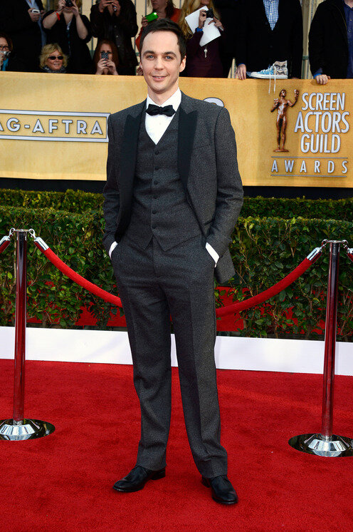
The Wild Party
by Andrew Lippa
Miami University Theatre • April 2017


About the Design
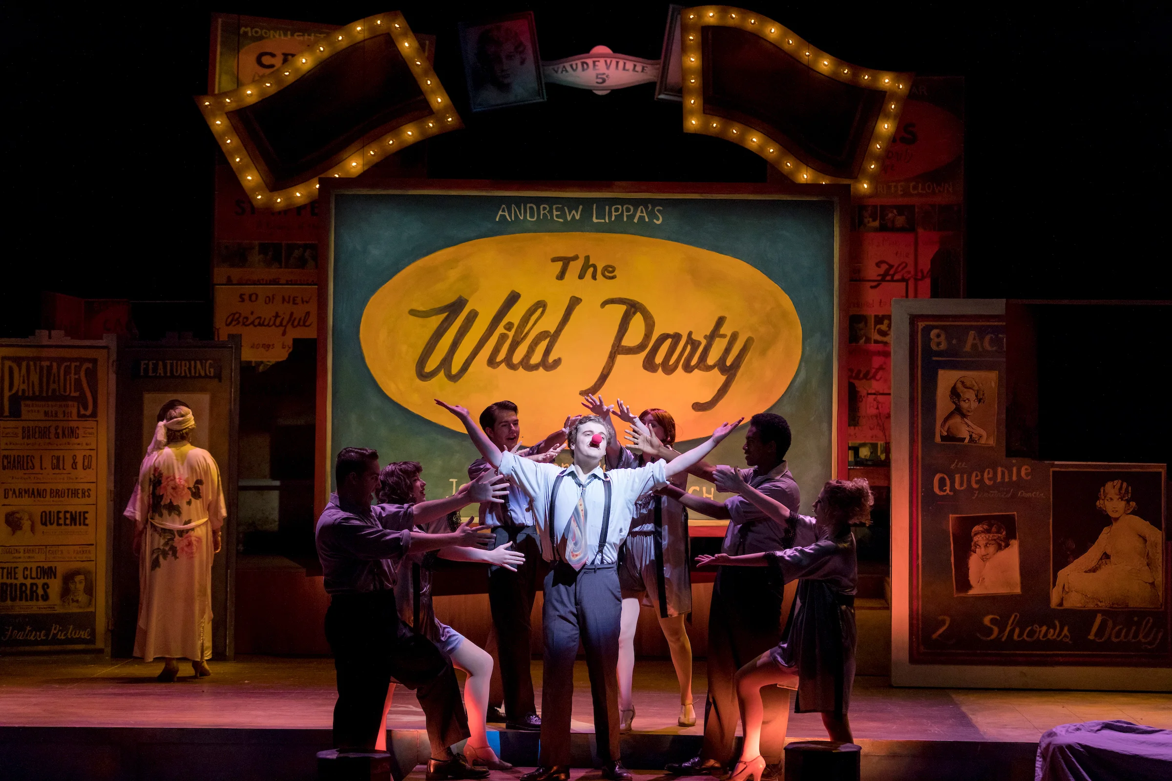
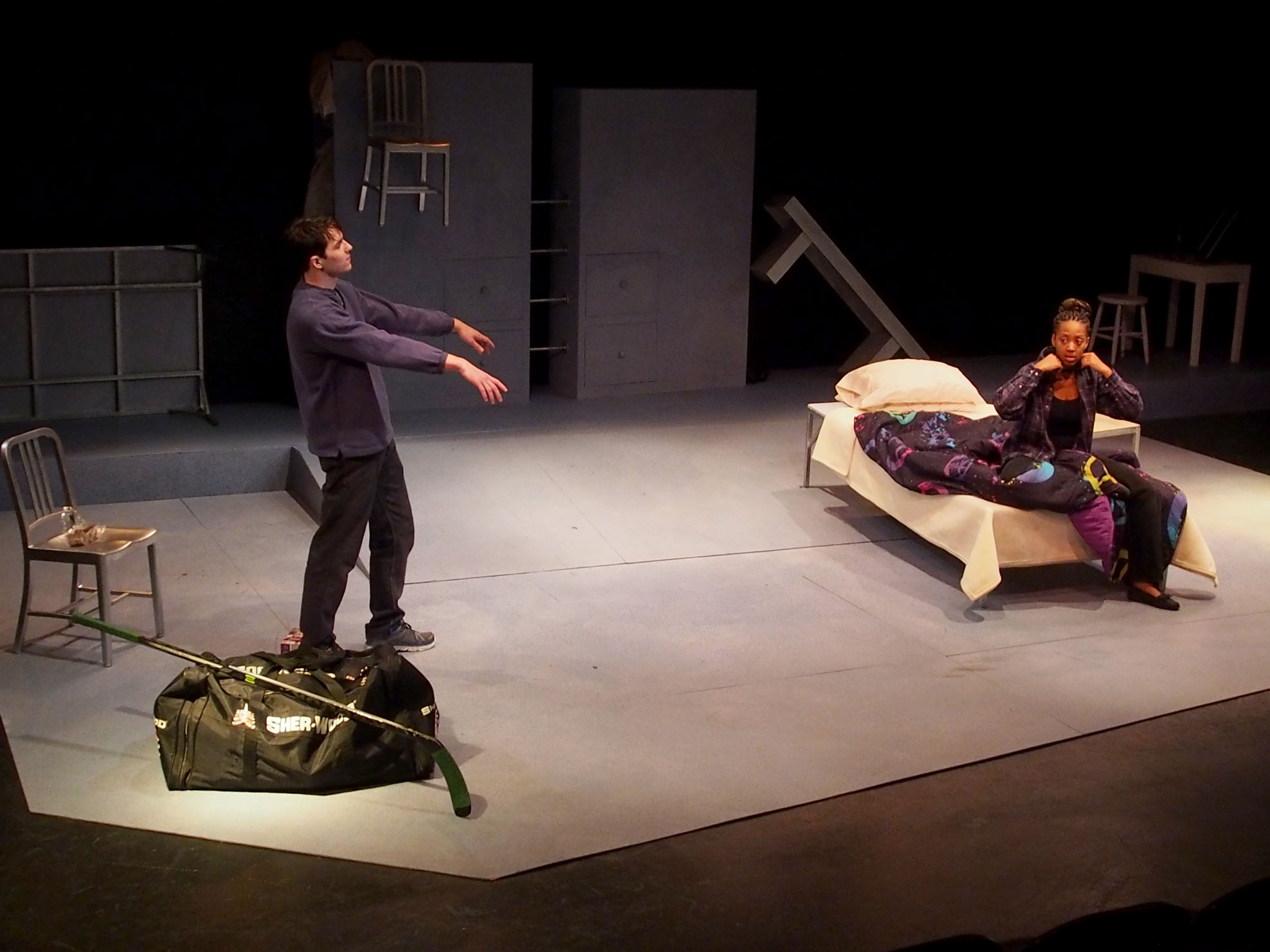
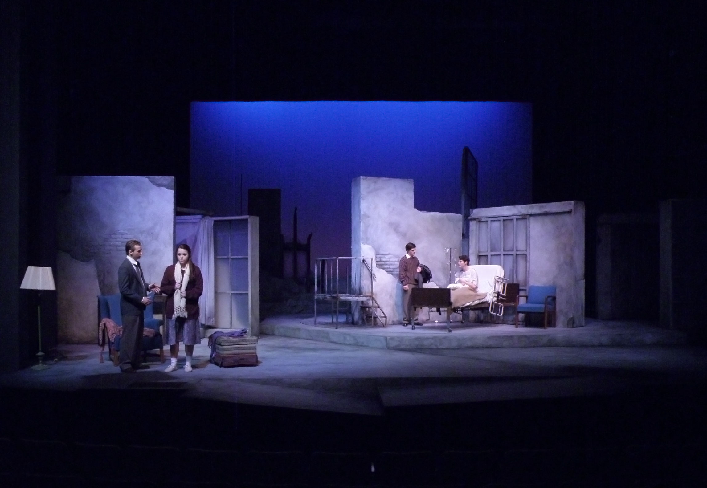
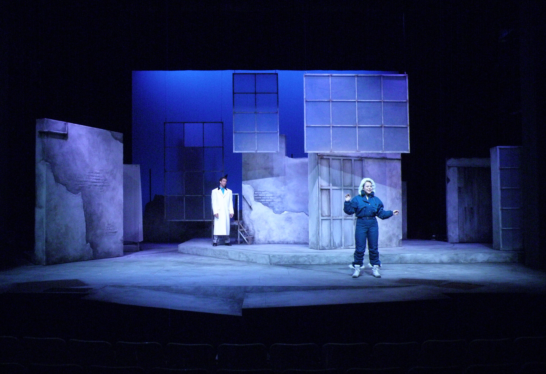
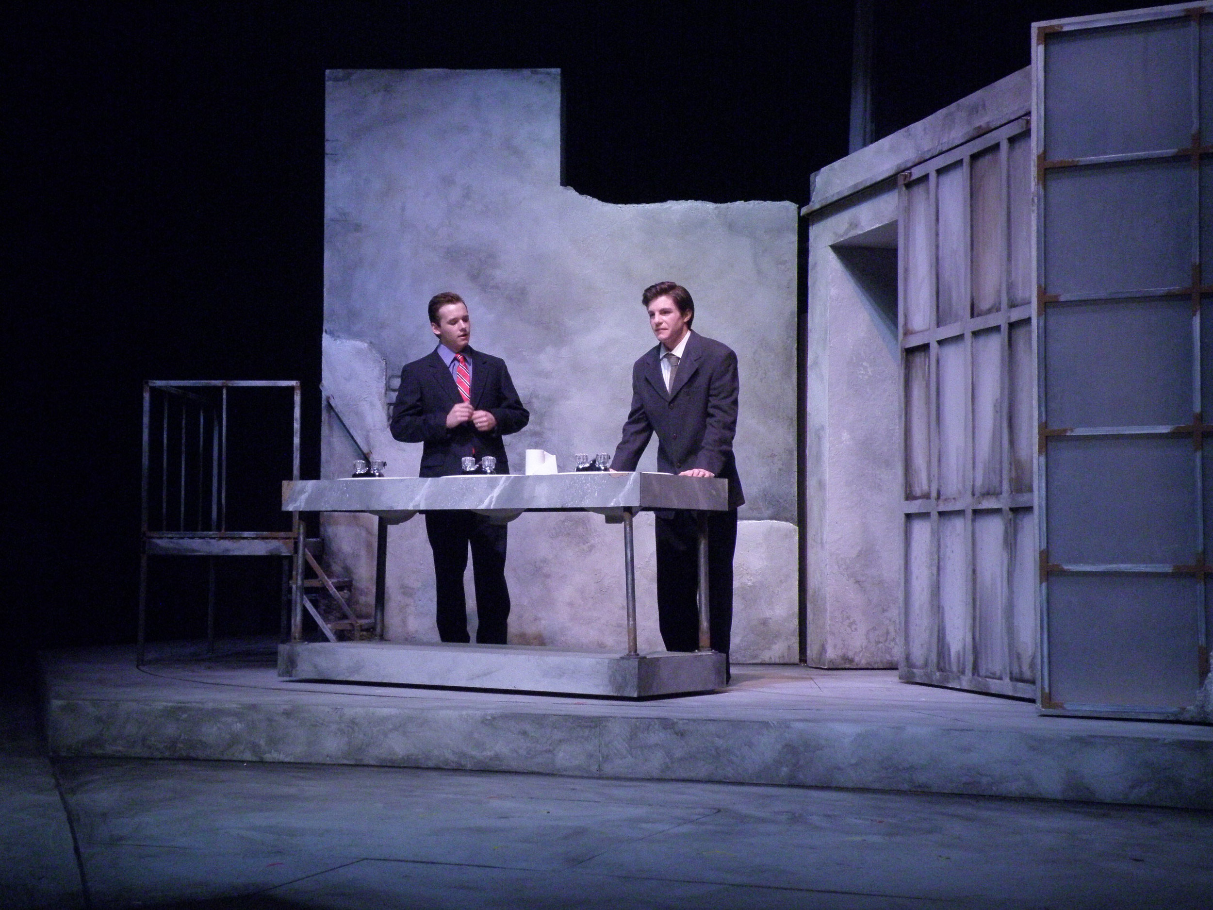
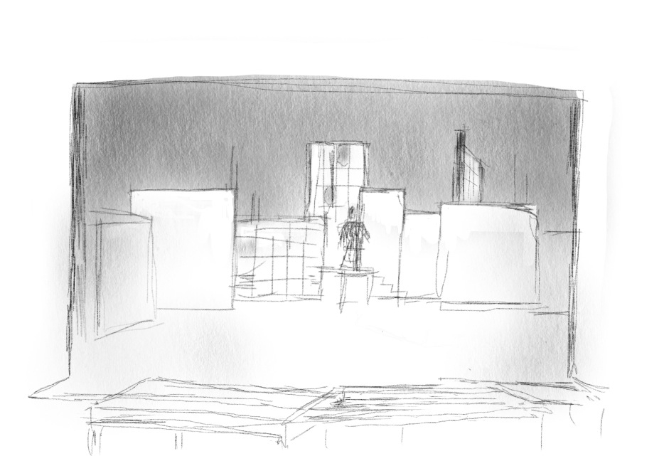
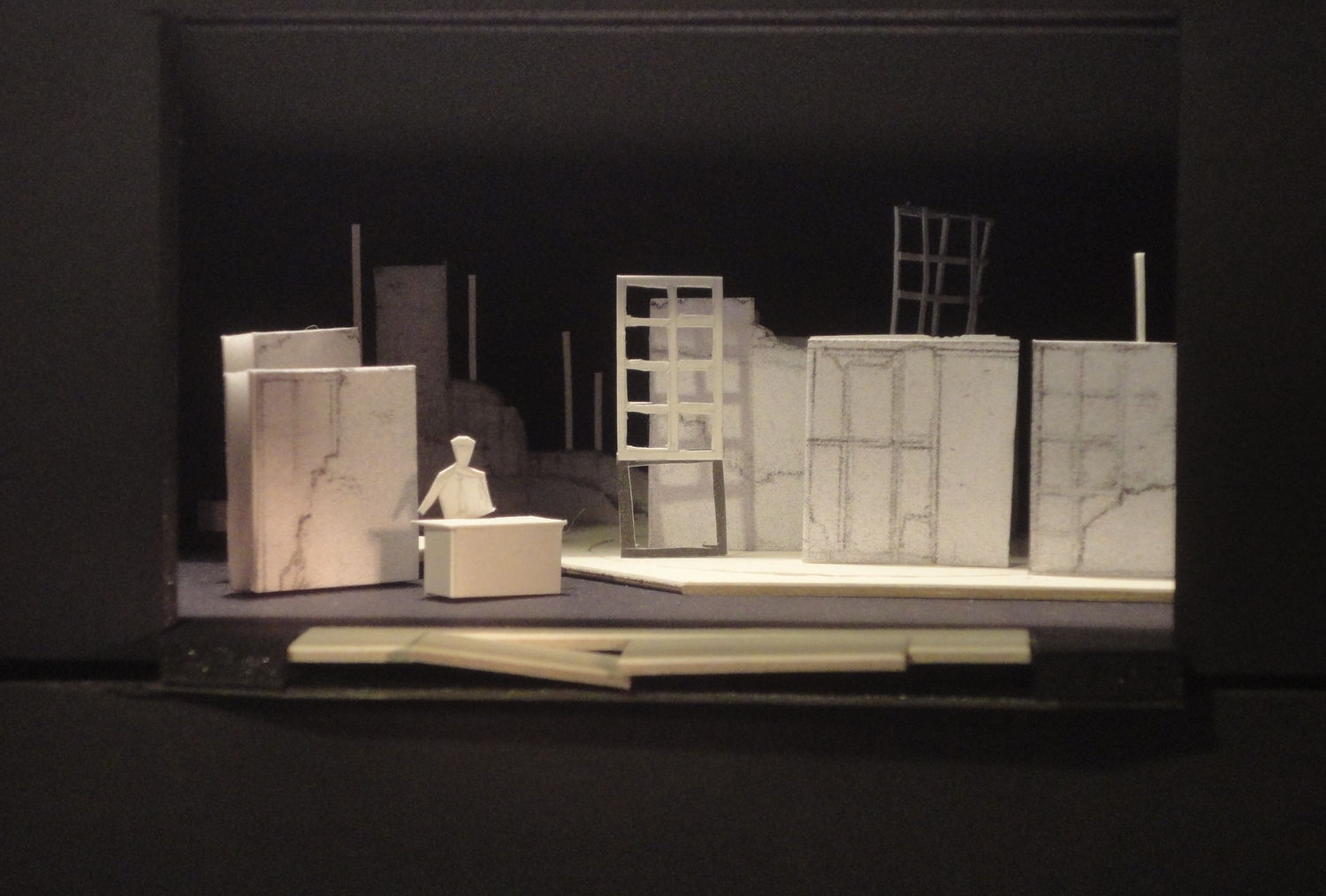
Queenie and Burrs are entertainers living in Manhattan in the late 1920’s, one of the most decadent eras of American popular culture. Their world is both glamorous and brutal, and they are creatures of it. Though Vaudeville stars, Vaudeville was on its way out. They live in relative squalor, either for lack of money or lack of will to do anything but enjoy the pleasures of life. At the start of the play they are living in a bubble that needs just one provocation to pop.
Joseph Moncure March sets his poem in this sensuous world of beauty and ugliness, and Lippa amplifies the emotions through music. The scenic environment is inspired by the American artist Reginald Marsh. Marsh’s work has been characterized as offering “…scenes of people acting out with unbridled gusto. He charts sociability as it tilts toward debauchery, as on the mixed-race dance floor of The Savoy, where everyone’s dancing the Lindy Hop. If he were alive today, he’d be out at Brooklyn raves watching artists take molly” (Andrew Russeth, The Observer).
The painting “Twenty Cent Movie” became the central inspiration.

The colors are vivid and gaudy. The movie cards call out the salacious qualities of pre-code Hollywood films. The destruction of Vaudeville in part by Hollywood is also significant. The specter of the future surrounds this party, and makes its way into the party space itself.
Adapting the visual vocabulary of Marsh’s painting, the graphic references to cinema are expanded to incorporate the world of Vaudeville. The Vaudeville graphics are less colorful, less vibrant, part of the unraveling tapestry of what was. The sexually charged movie descriptors are intermixed with snippets of March’s actual poem, matching them in their rawness. The style of Marsh’s text is carried through in the graphics incorporated into the design.

Sample of Paint Elevations
The paint elevations were created in Illustrator and Photoshop, then printed on a large format printer and pasted onto the walls.
Additional Design Materials


Production Team Credits
Directed by Ed Cohen
Costume Design by Melanie Mortimore
Lighting Design by Marly Wooster
Technical Direction by Curtis Mortimore
Bat Boy
Story and book by Keythe Farley and Brian Fleming,
Music and lyrics by Laurence O’Keefe
Gates-Abegglen Theatre, Miami University • April 2019


About the Design
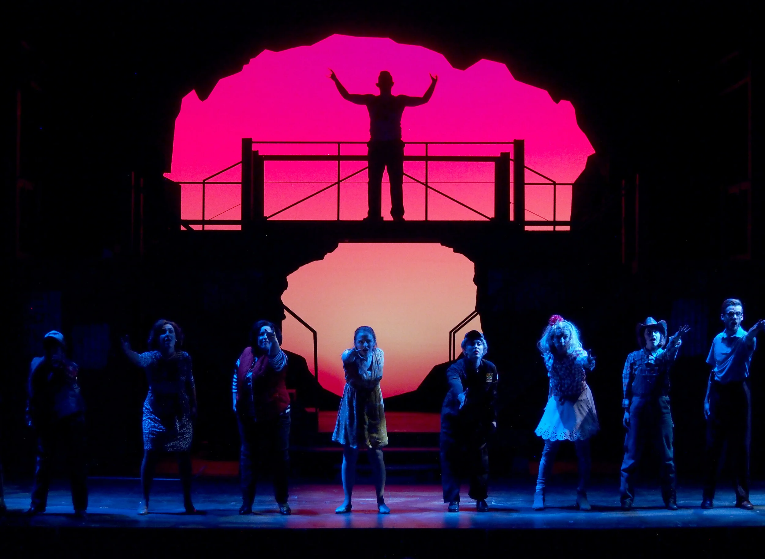
Bat Boy is a kooky musical that gives us the origin story of the popular Weekly World News character. It is set in a fictional small town of Hope Falls in the deep hollows of West Virginia.
We rode with the idea that hope had indeed fallen in the town. The coal industry has left, leaving the the citizens are isolated and afraid of change. They blame Bat Boy, the weird outsider, for their woes. Research that caught my attention included rusted out and dilapidated coal tipples. And caves.


The image of a spiraling vortex was a dominant in our early discussions about environment. The mouth of a cave, the mouth of a bat child tearing the neck of a cow, a mouth screaming in fear. Confining, circular movement became very important.
The action moves fluidly from scene to scene. The look of the main unit comes from coal tipple research, with pieces added to represent different locations. The cyc is revealed through a circular opening made of a ground row, a header, and moveable wings. These units operated like an iris, always keeping the shape of a vortex, yet changing in scale and size as the characters became more deeply trapped in their own cycles of fear and hate. The aperture was at its fullest only when the prevailing emotion on stage was love, for only love can get us through our darkest moments.
Here are sketches of the different scenes.


Production Credits
Directed by Suann Pollock
Costume Design by Melanie Mortimore
Lighting Design by Marly Wooster
Technical Direction by Curtis Mortimore
Stupid Fucking Bird
by Aaron Posner
Miami University Theatre • October 2016


About the Design
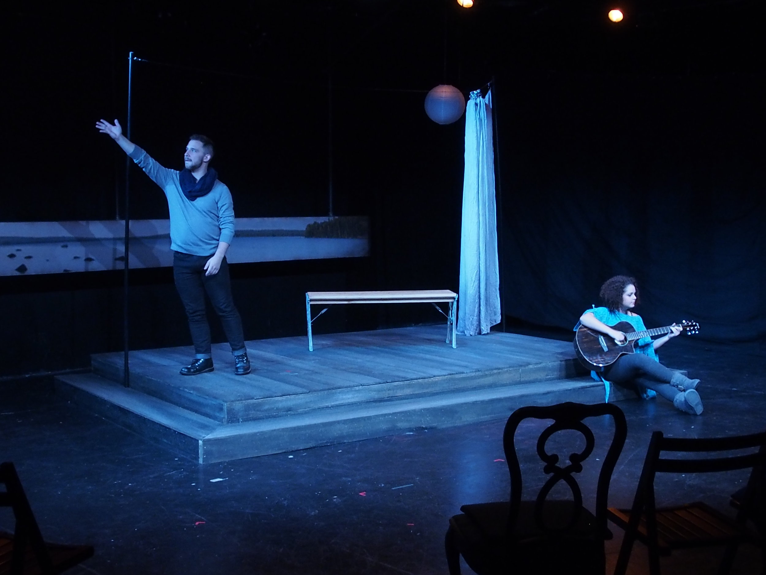
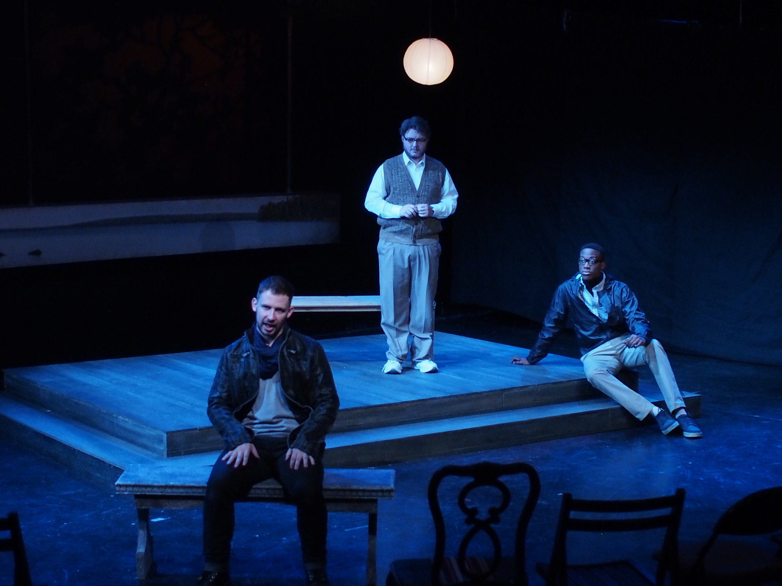
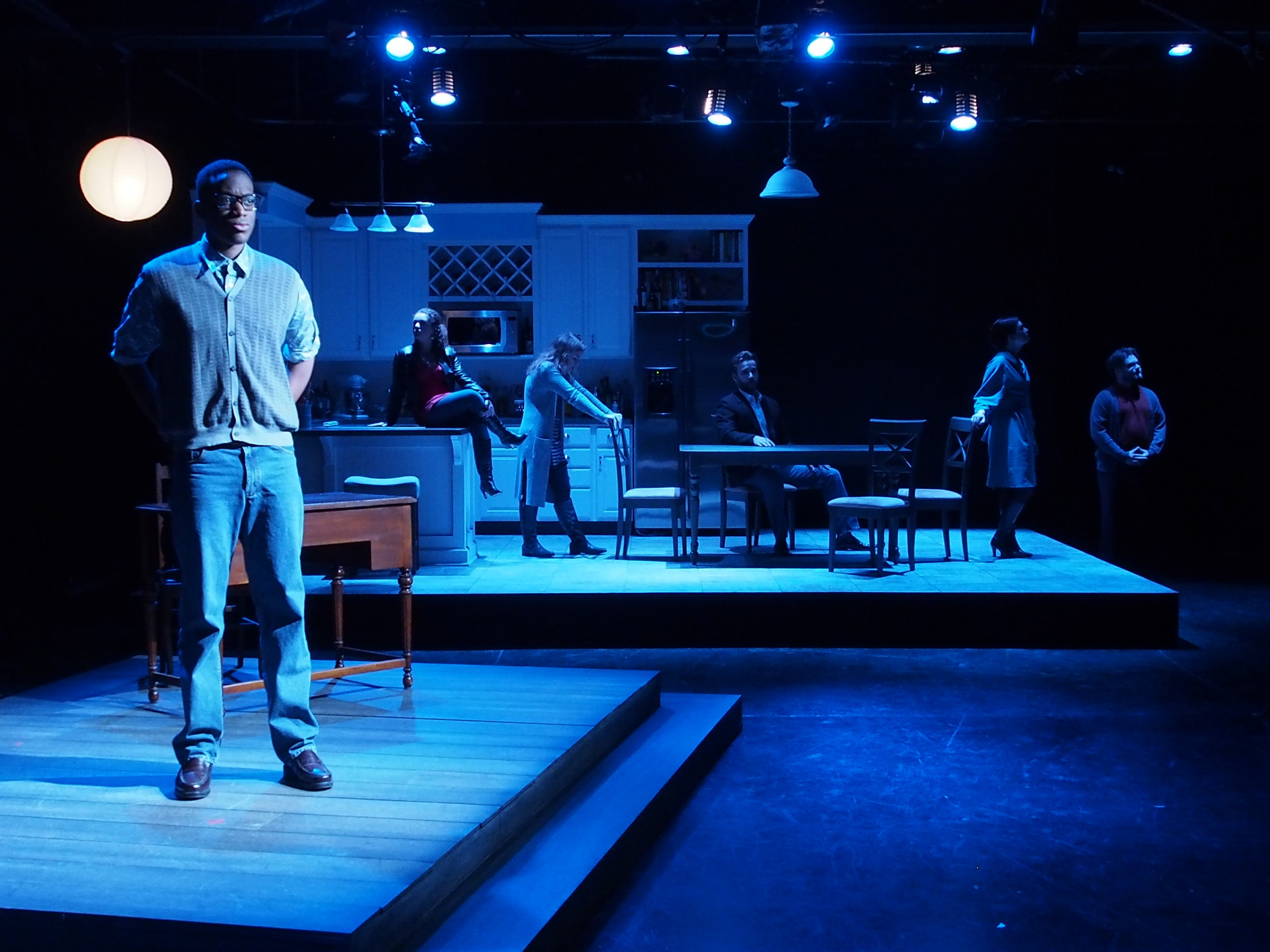
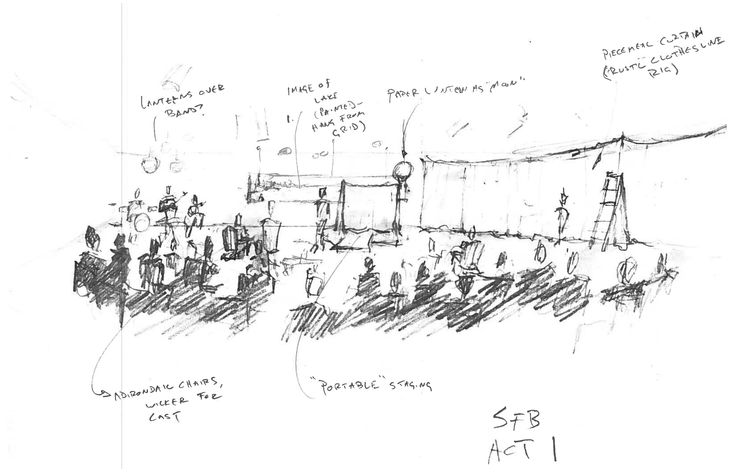
When we all started talking about what kind of environment to create for this production of Stupid Fucking Bird, what struck us was Posner’s magnification of theatricality. Here we have an adaptation of a classic performed by actors who may be characters but are also aware of being actors presenting a play. Such a meta convention seemed to require a kind of meta space.
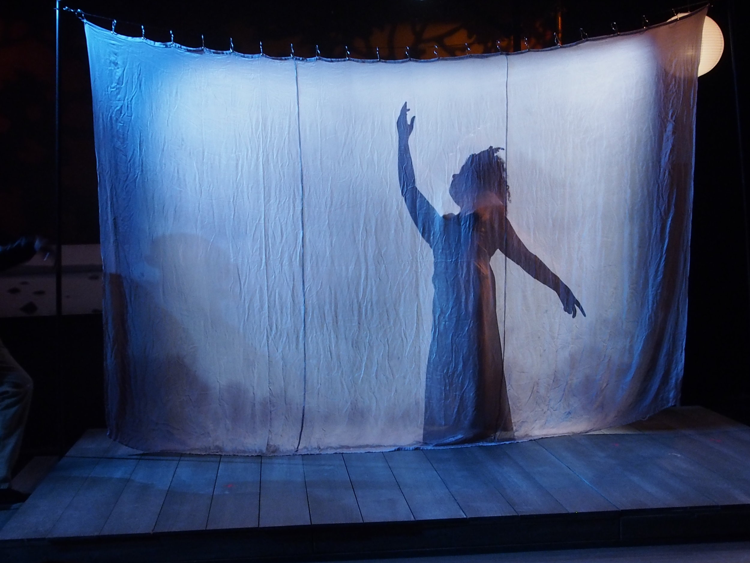
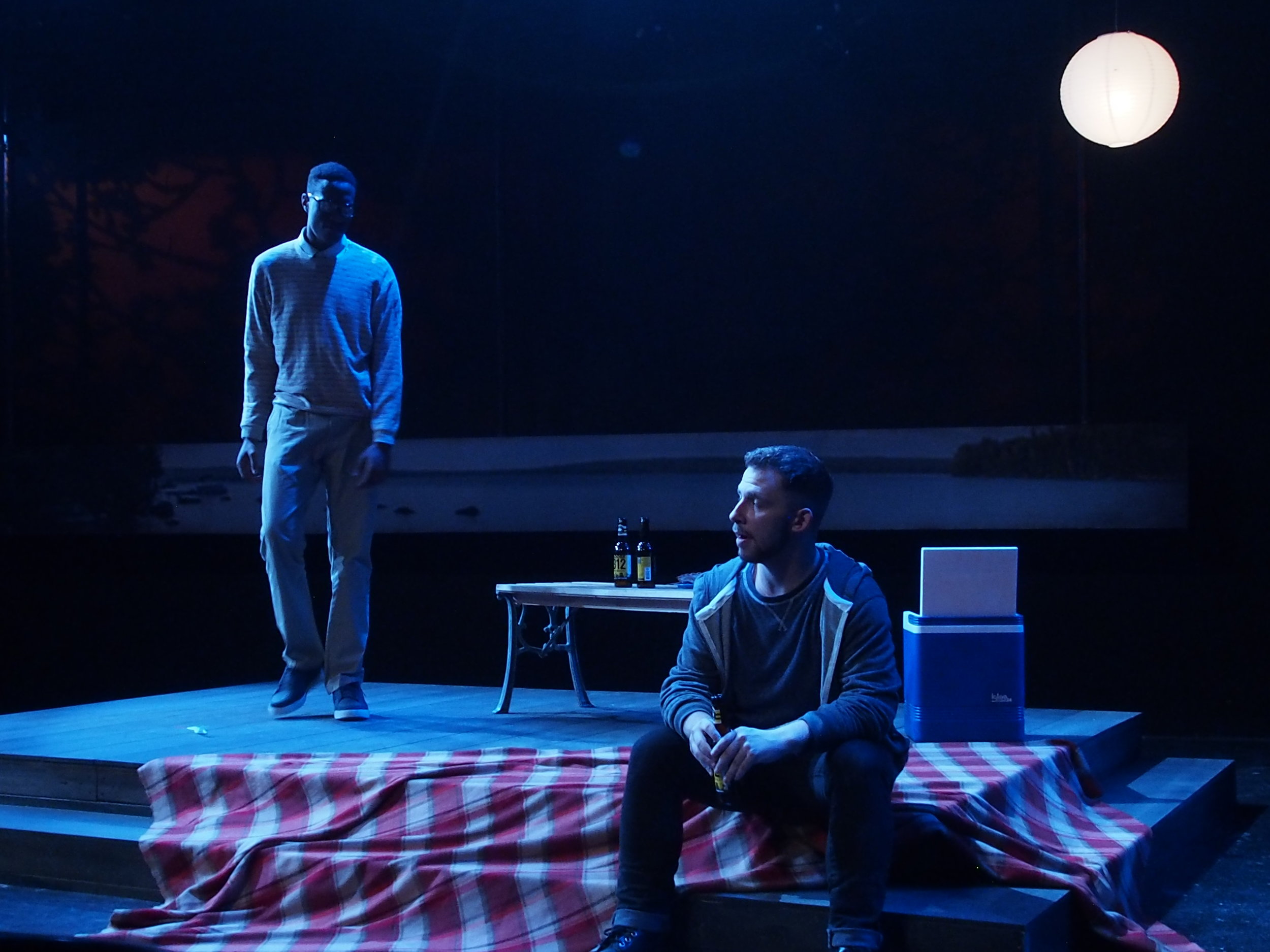
We were working in a black box, and the director was excited by the possibility of using all of the space. The first act begins with Con staging his play for his family. We made little distinction between the seating set up for that play and the seating for the actual play. We blurred the lines further by seating our audience in a mix of “found” chairs, as if we too were inviting friends to see a backyard production. We watched Dev set up and strike the “stage” space. Half of the theatre was further draped off, hiding the set for the second act. Place was suggested by a long representation of a lake landscape and a chinese lantern representing the moon. This theatrical representation came into play in Act 3 when the space was redressed to represent a study, and Con shoots a lamp from the ceiling.
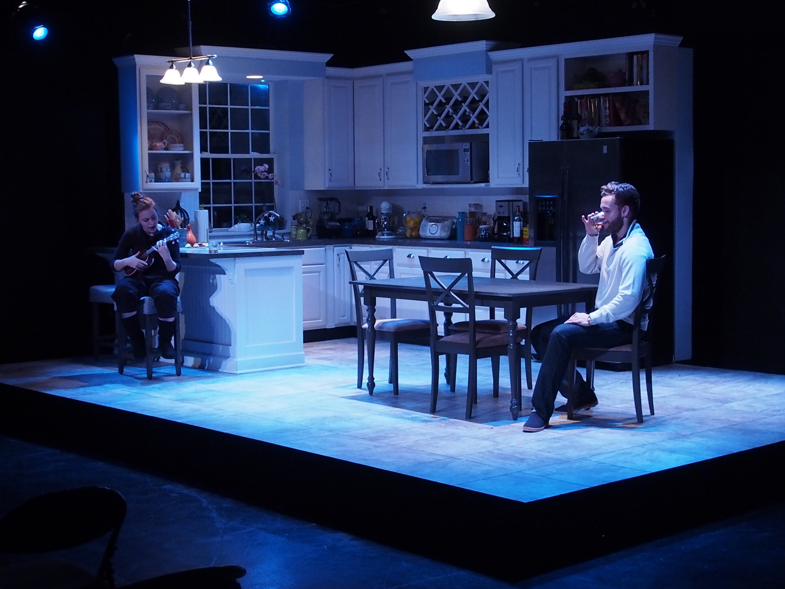
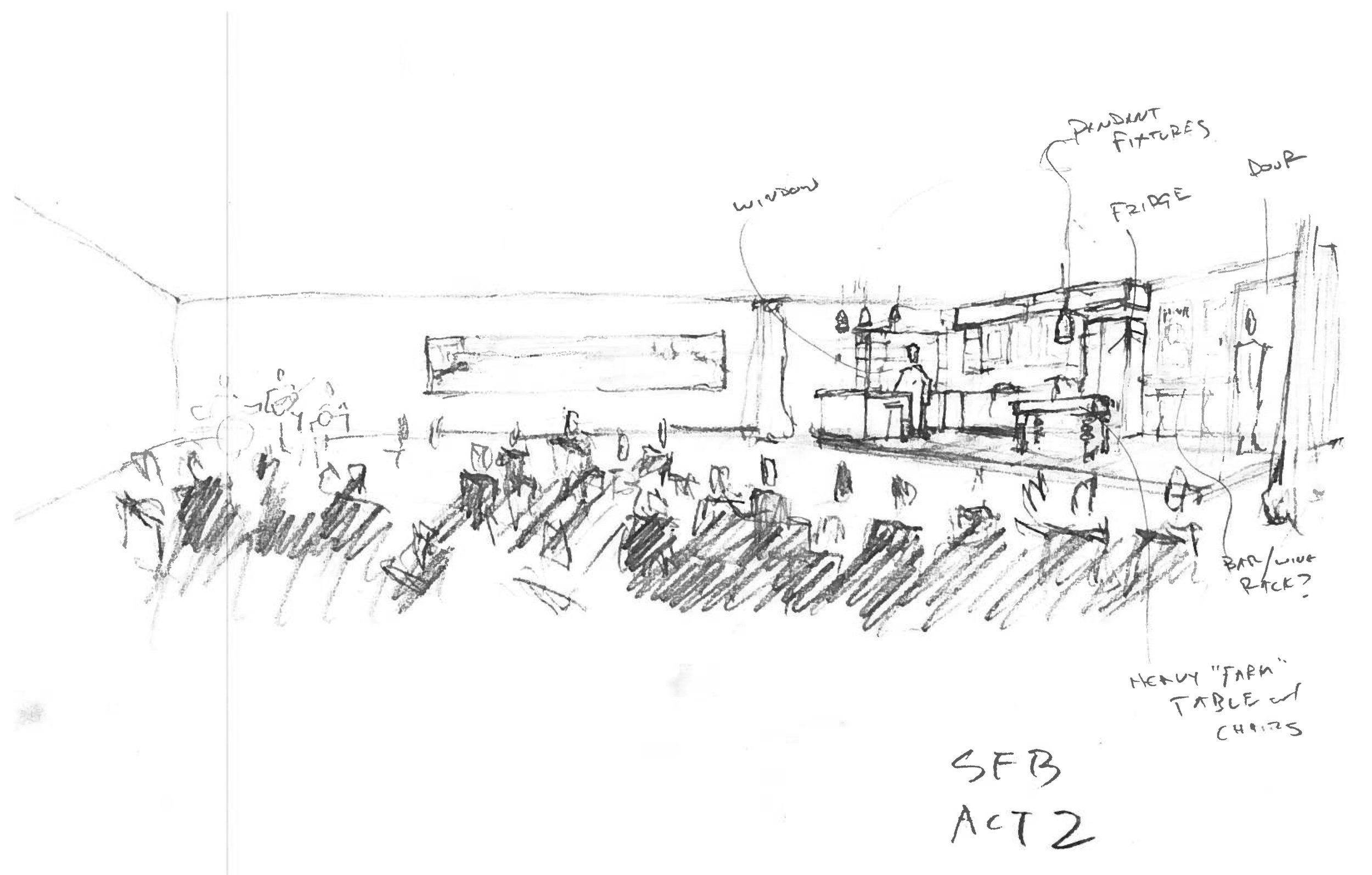
Between Acts 1 and 2, we invited the audience to adjust their chairs to face the draped section of the theatre. We pulled back the curtain to reveal the Act 2 location: the kitchen. The sudden escape into realism playfully references the work back to Chekhov. The kitchen set is meant to do what a good realistic set should: seem real, allow for realistic action, and help establish the social status of the characters.
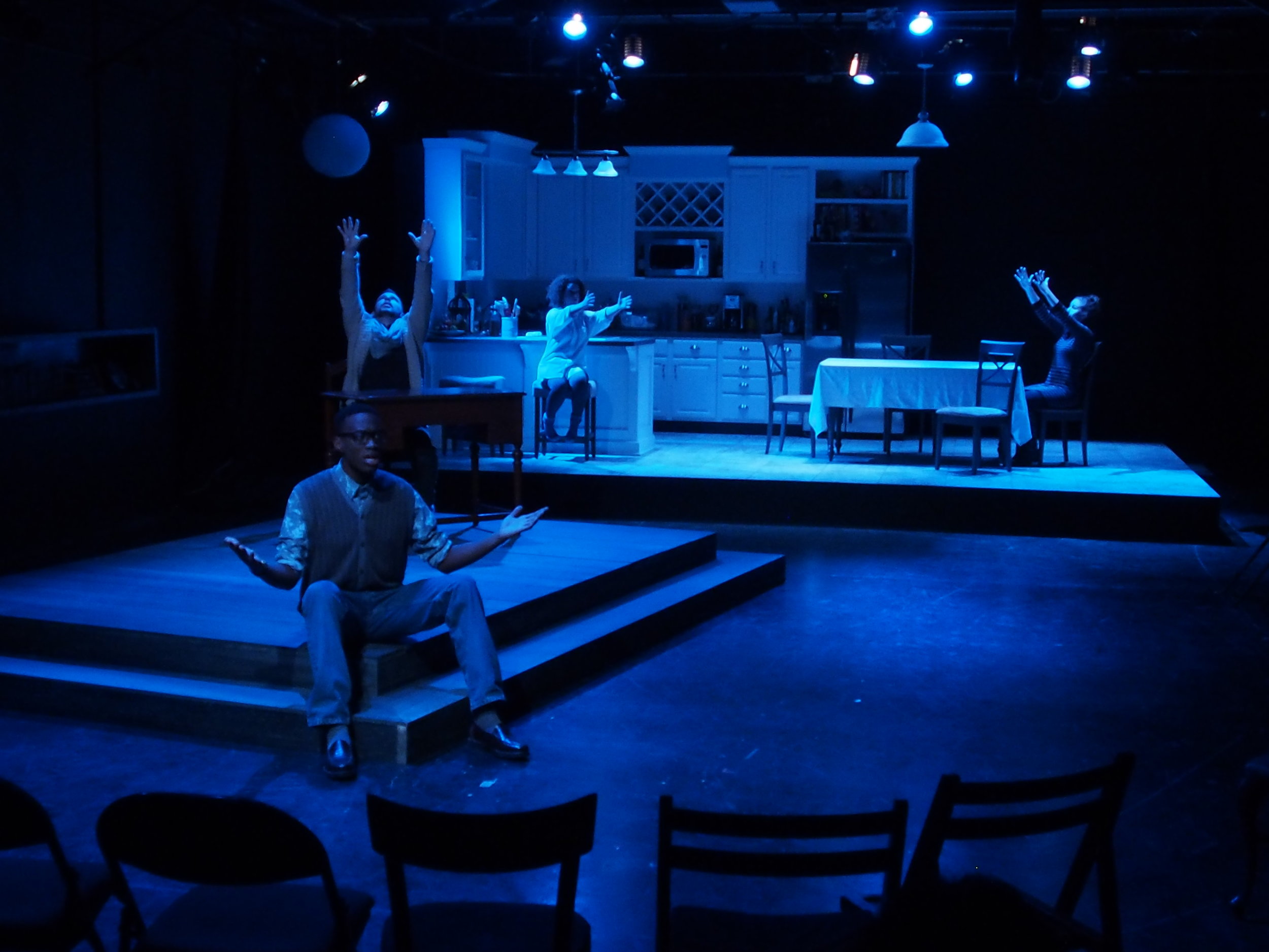
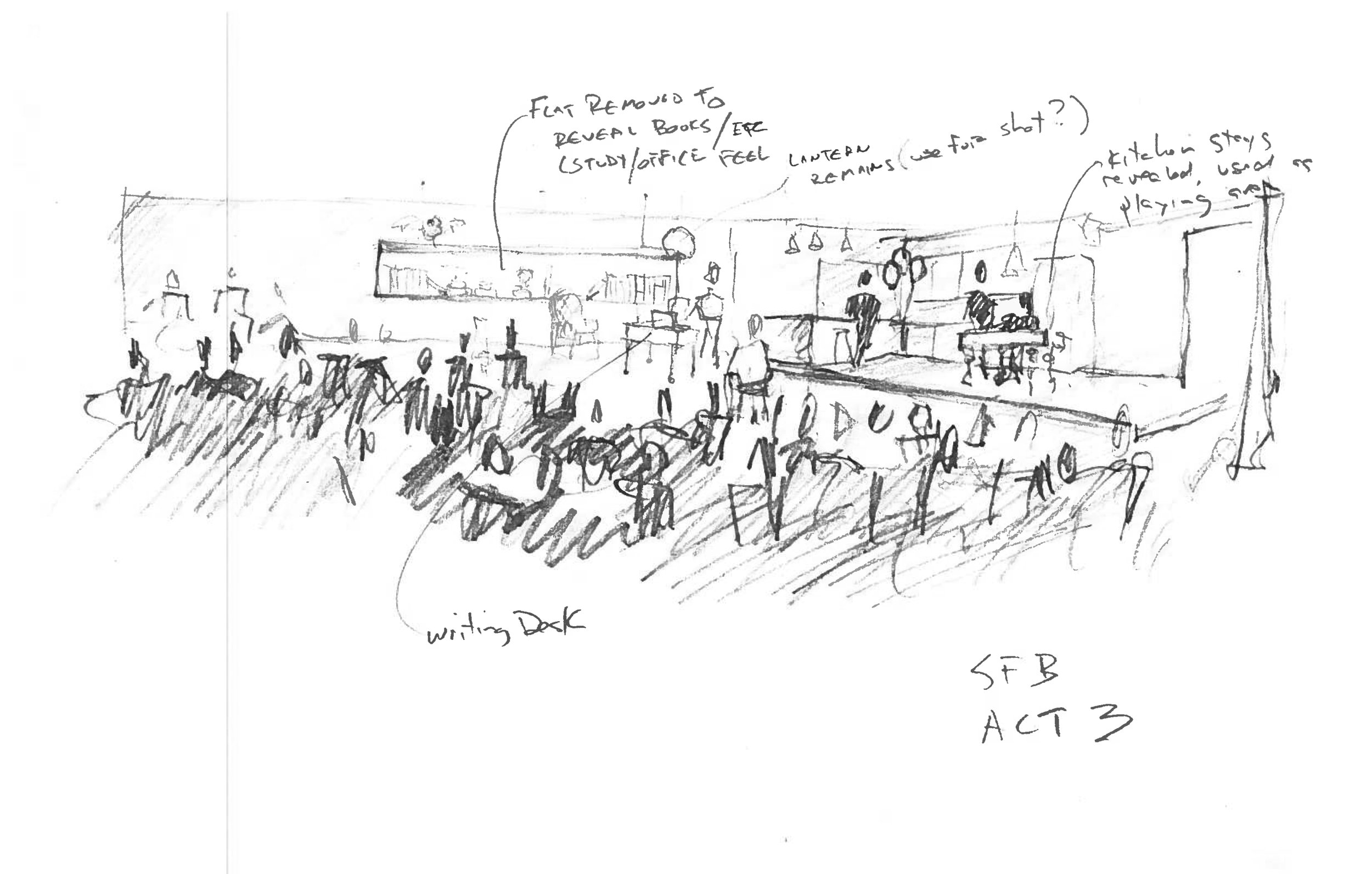
While the third act seems to be set on the patio or deck of the estate, we took advantage of the two spaces we already had. With a dressing change, the Act 1 area became a study adjacent to the kitchen. Both spaces were used simultaneously.
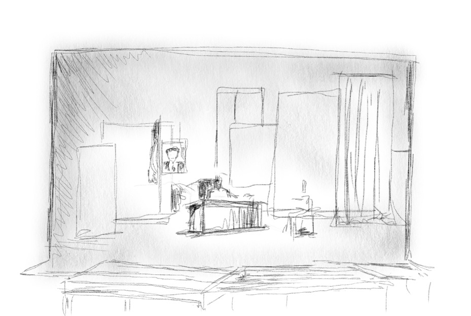
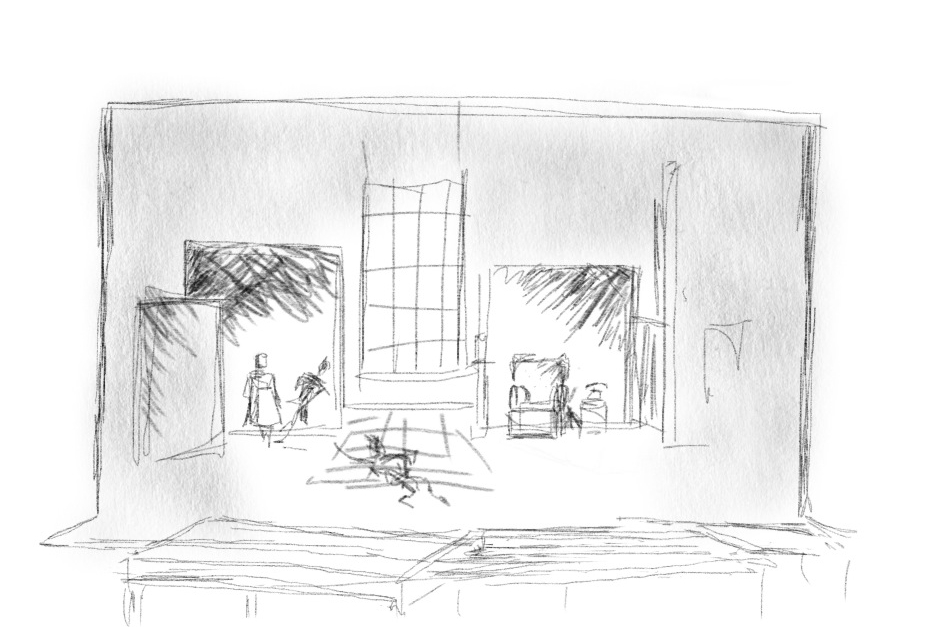
Process Materials
Production Credits
Directed by Saffron Henke
Costume Design by Melanie Mortimore
Lighting Design by Marly Wooster
Technical Direction by Curtis Mortimore
Into the Woods
Miami University Theatre • April 2013


About the Design
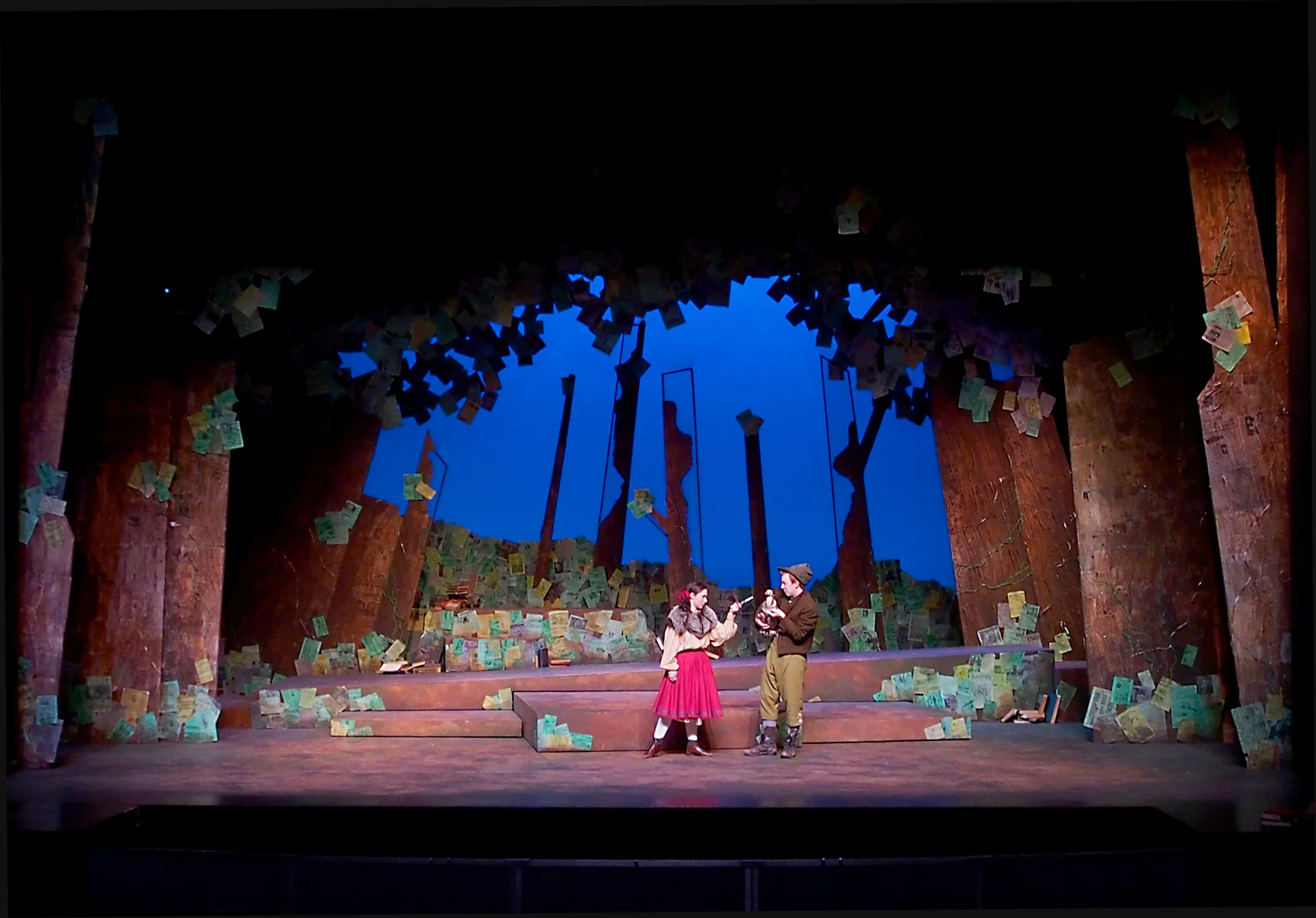
The characters in Into the Woods have been with us all our lives. Forced to test and try their humanity, the characters learn how to connect to each other and to us by telling their stories.
Since Sondheim and Lapine use both obvious and subtle metaphor to tell the story, I imagined "the woods" as a collection of stories. We use books, magazines and newspapers to tell our stories, so the textures of the trees are built up with pages from these sources, then washed over with translucent color to tie them together. The oldest print materials (illuminated manuscripts, broadsides) are layered at the base of the trunks, and as you move up the trunks, newer and newer newspapers take over. It is hard to make these out in the production shots. You can see it a bit here:

Foliage (overhead and at the base of the trees) is suggested by magazine pages from all over the world, spanning the past 150 or so years. I ran some vines made of copper wire up the trees, suggesting a new conduit for transmitting stories.
One of our goals was to avoid the "precious" feel of the storybook characters, so we took inspiration from the the storytellers of Eastern Europe, using the early 20th century as a visual source. The style nods to modernism and constructivism, and features exposed theatrics. The animals appear as puppets, with the puppeteer visible to the audience. We did our best to keep the characters human and relatable.
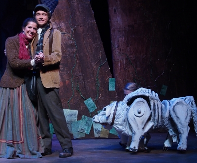
Milky White

Wolf and Little Red puppet
Process Materials


Images taken hiking through nearby woods
Please take a look at the drafting plates >>

Show Credits (visual components)
Direction and Scene Design by Gion DeFrancesco
Costume Design by Letty Delgado
Lighting Design by Russ Blain
Puppet Design by Patrick Hayes
Technical Direction and Props by Steve Pauna
Urinetown: The Musical
Miami University Theatre • Spring 2009


About the Design
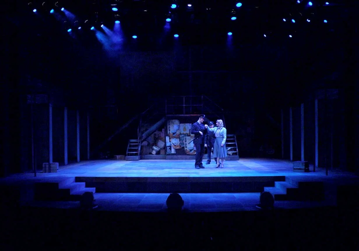
Urinetown draws on many sources including the works of Bertolt Brecht and Marc Blitzstein’s The Cradle Will Rock. Caldwell Cladwell may be a direct descendant Cradle’s corrupt Mr. Mister, the ruthless capitalist who ran the fictitious Steeltown USA.
We chose to embrace the feel of the 30’s, the era of Cradle, in our stylistic choices. In Brechtian tradition backstage is not masked and musicians are visible as part of the set. The true power in this town resides in Cladwell’s Urine Good Company, and to represent that, a UGC billboard is a dominant element in the space. In many ways, UGC has made this place as oppressive as a prison state. We wanted to show that in the set. Lots of steel. In this shot you can see what looks like guard towers flanking the set.
The city is also littered with UGC propaganda posters done in the graphic style of the Works Progress Administration. Joining these are posters of for other businesses in Urinetown, and since the musical alludes to other musicals, so too do these posters. The “poor” are burdened further by having to push the scenery around to facilitate scene changes.
While the themes of oppression and social change are present, the musical is first and foremost a comedy. I hope you will be amused by some of the more tongue-in-cheek elements of the set that lend the environment a bathroom feel, from the tile floor to the stalls that the actors must go through to access the stage. And because Urinetown also makes fun of the Broadway musical industry, don’t be surprised to find small visual references to other musicals!
Process Materials


UGC Posters


Show Credits
Direction by Suann Pollock
Costume Design by Meggan Peters
Lighting Design by Geoff Fishburn
Technical Direction by Steve Pauna
Albert Herring
Miami University Opera • Spring 2014


About the Design
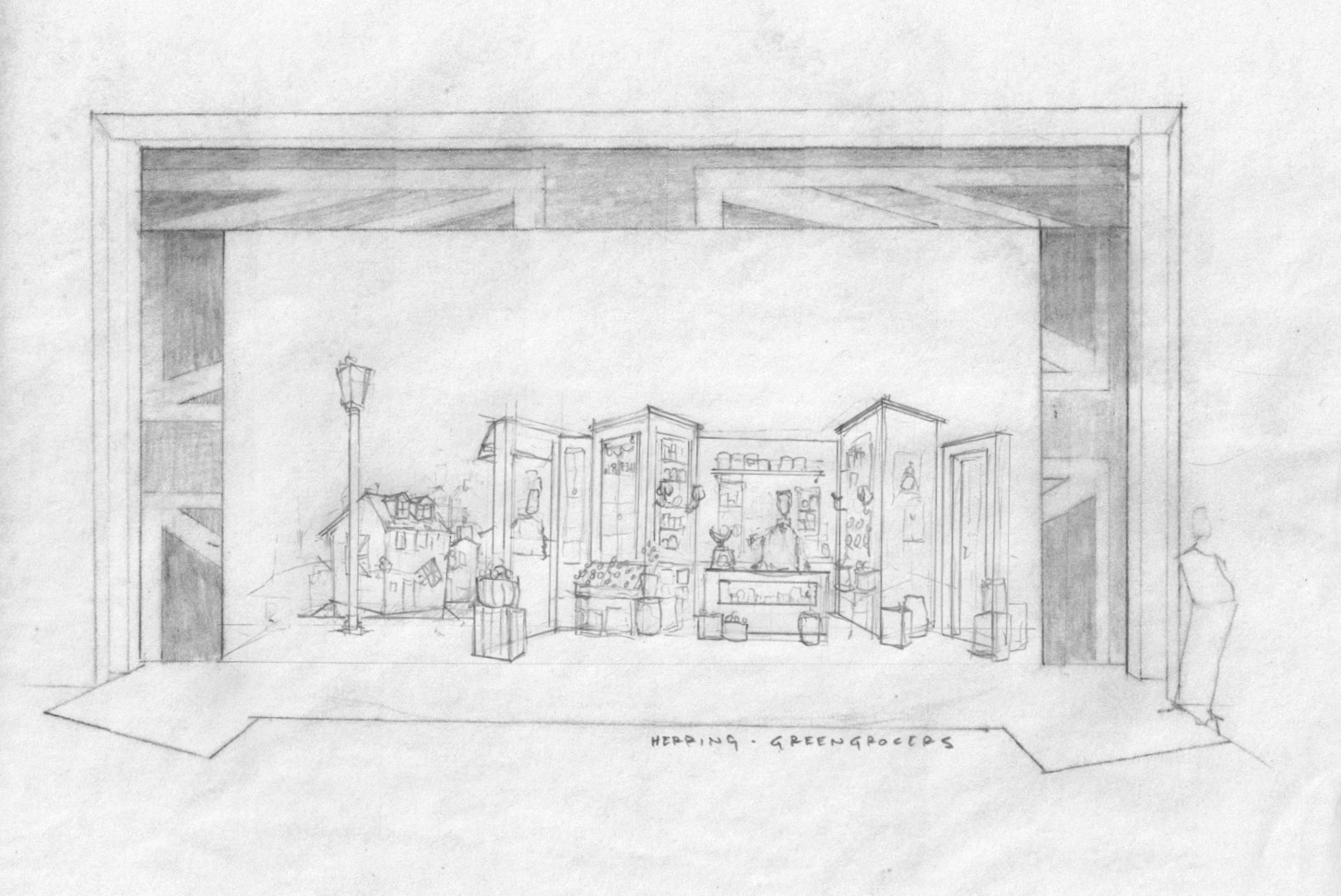
We were pushing the action of the opera into the 1910's, inspired by the first seasons of Downton Abbey. Our biggest concern was making sure the scene shifts could be done a vista in the amount of time Britten scored. I designed each section of wall to rotate easily by two or three actors to make the shift between Lady Billow's manor to the greengrocer shop go quickly, and for all the walls to be removed for the picnic in the churchyard.
The Union Jack became one of the unifying design motifs in the set, playing off the spirit of nationalism Britten weaves into the music and Crozier the libretto.
While our budget was healthy (about $7,000), we only had about three weeks to build and paint.


Paint Elevation, Ground Row
Show Credits
Direction by Lee Kimball
Conducted by Ben Smolder
Costume Design by Meggan Peters
Lighting Design and Technical Direction by Josh Wilson
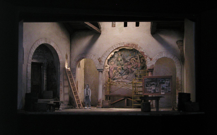
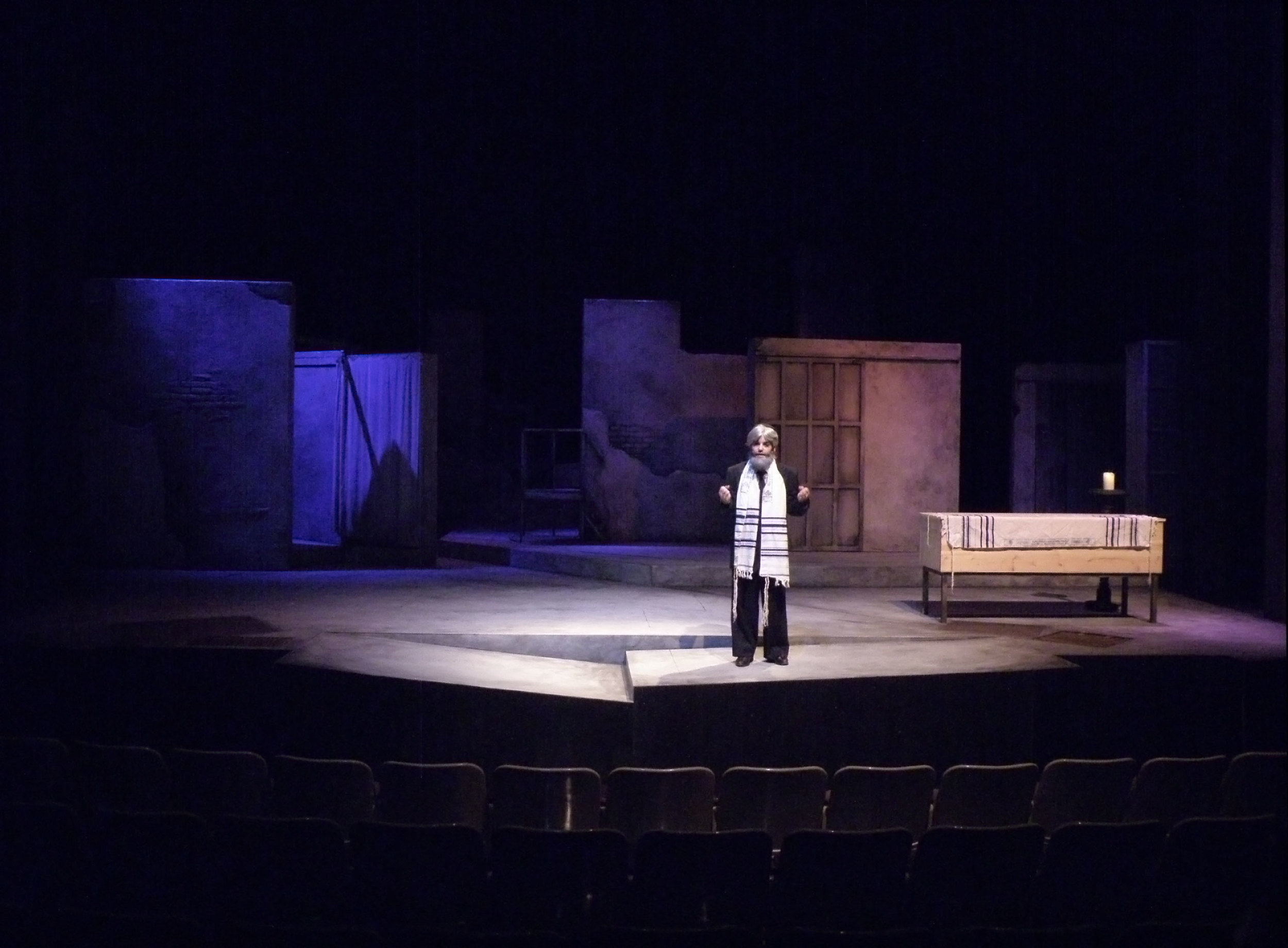
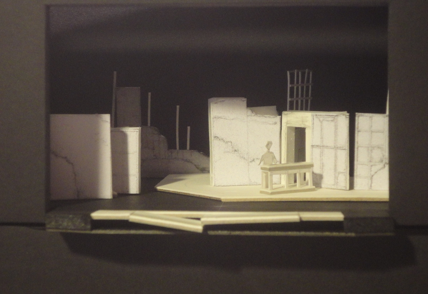
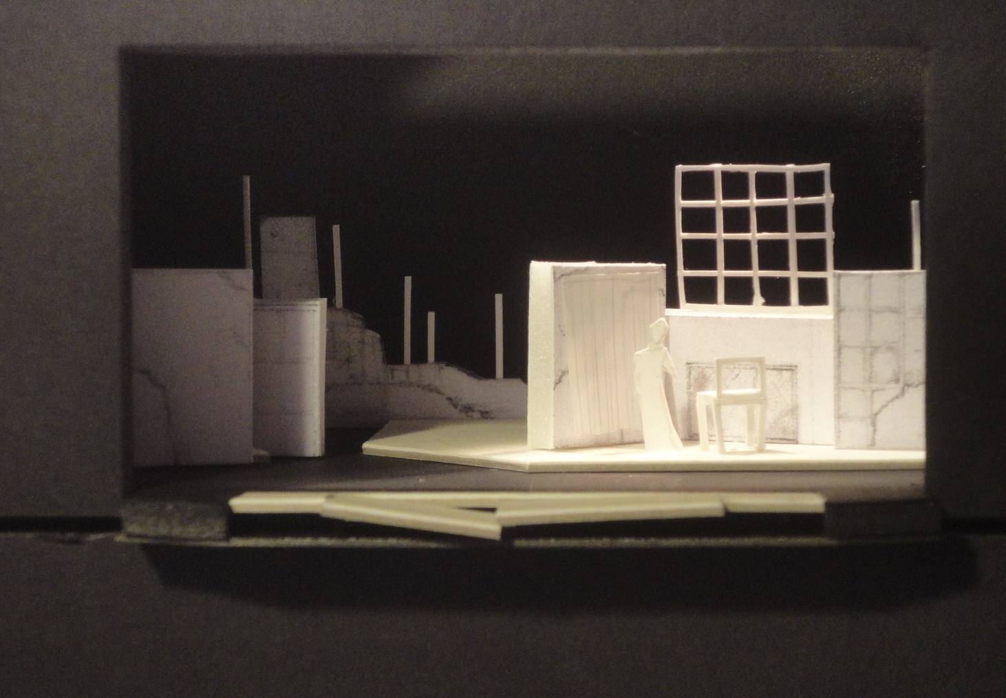
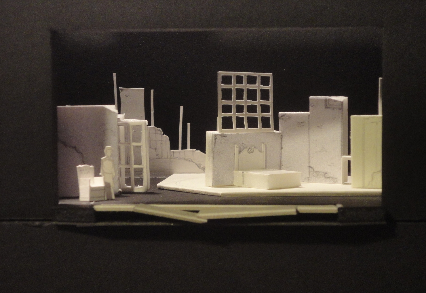
Pentecost
by David Edgar
Miami University Theatre • April 2005

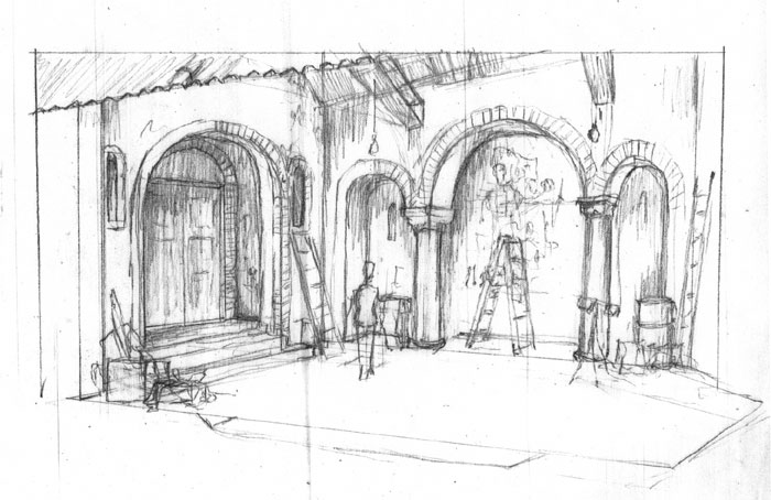
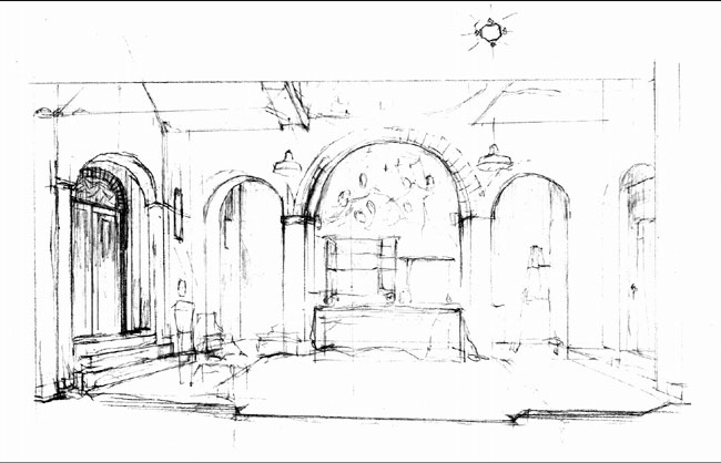
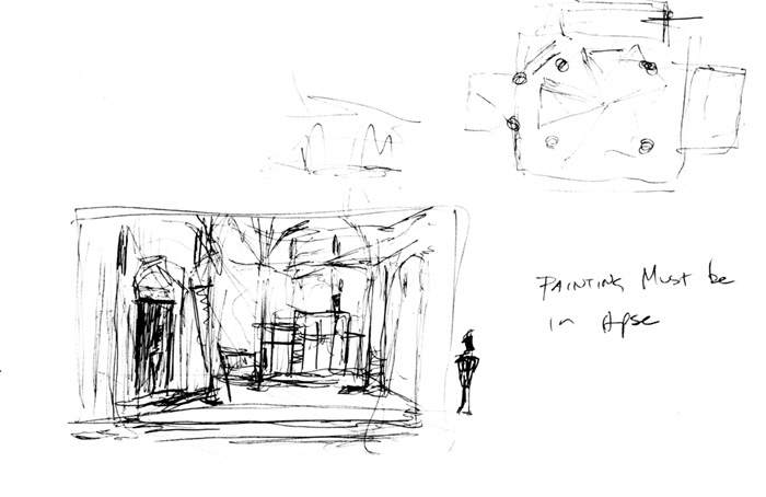
"The Lamentation of Christ" fresco
Paint elevation
About the Design
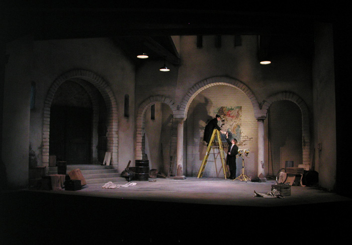
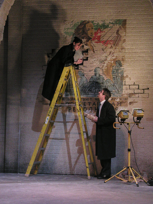
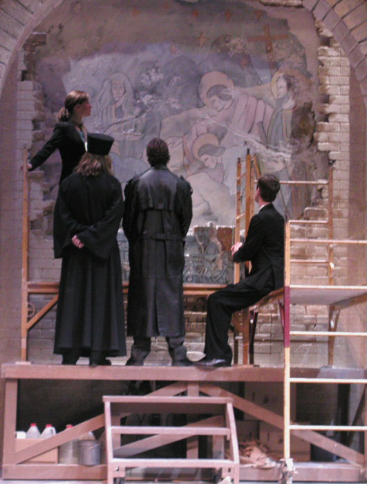
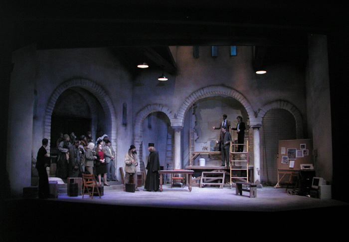
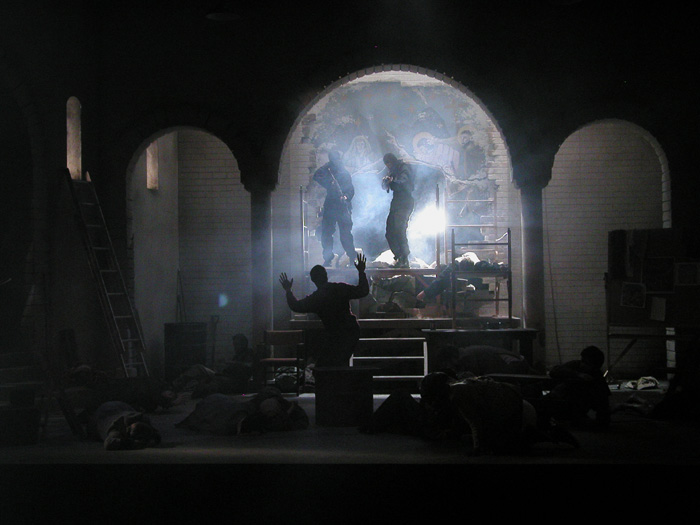
But first a little about the plot. Art historian discovers a 14th century Italianate fresco behind a brick wall in an abandoned building in a post-Soviet eastern European country. The building was a church, then a mosque, then a warehouse, then a Soviet museum.
In the first scene, the fresco is hidden. It is totally revealed in the next scene, then a scene later is being covered so that it can be removed to another location. The painting proves that the Renaissance started not in Italy, but in an Eastern populated country. As this is happening, a band of political refugees enter the building, taking the restorers and fresco hostage. The local government takes control of the situation by storming the building with commandos and blasting through the fresco.
Everything about the show pushed our limits as a medium-sized theatre program. We really wanted to make as realistic of a space as we could. The research comes from churches in Croatia, Bosnia, and Bulgaria. These are huge spaces, and for the first time I designed walls that were over twenty feet tall. Once the walls went up on stage, the director commented on how the architecture helped raise the stakes of the actors.
The fresco wall was a series of large inserts that were swapped out during blackouts. The final insert crumbled into pieces and was reassmbled every night.

Some research

Interior research
Process Materials
Show Credits (visual components)
Directed by Ann Elizabeth Armstrong
Costume Design by Lin Conaway
Lighting Design by Jay Rozema
Technical Direction and Props by Steve Pauna
Rent
Miami University Theatre • Fall 2013


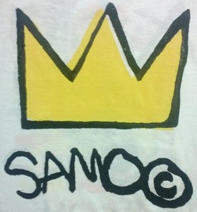
Basquiat research
About the Design
I was excited to do this project because it was conceived of as a "stripped down" version in a black box space. Suann, the director, wanted the space to feel very environmental, very East Village. In the previous season I designed Angels in America with a bunch of warehouse style windows, steel levels, and metal sliding doors. We were able to reuse much of those, covering every surface with graffiti.
We mixed up the ground plan and the seating, like medieval "stations" placed in between groups of seats. Instead of using theatre seats, we used every random chair from our furniture storage room, plus a few couches and benches. The audience became part of the company. All of the furniture and props needed for the different locations were somewhere in piles of objects placed around the space.
This was the third or fourth time I've done a set with a ton of New York graffiti. This time I tried to incorporate elements of early Basquiat. There are many "Samo" variations and a few crowns.
We ended up spending about $600 on the set.
Show Credits
Direction by Suann Pollock
Costume Design by Meggan Peters
Lighting Design by Russ Blain
Technical Direction by Tom Featherstone
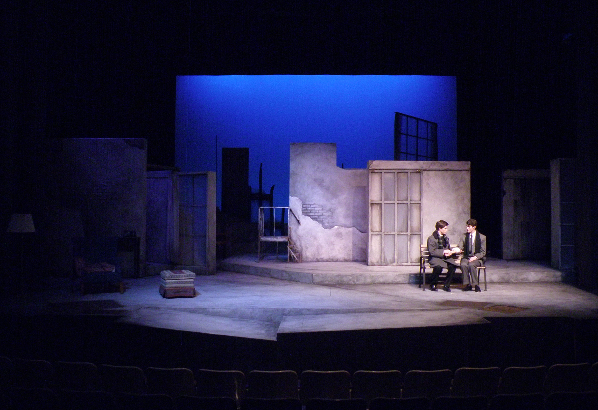
Gruesome Playground Injuries
by Rajiv Joseph
Miami University Theatre • November 2013
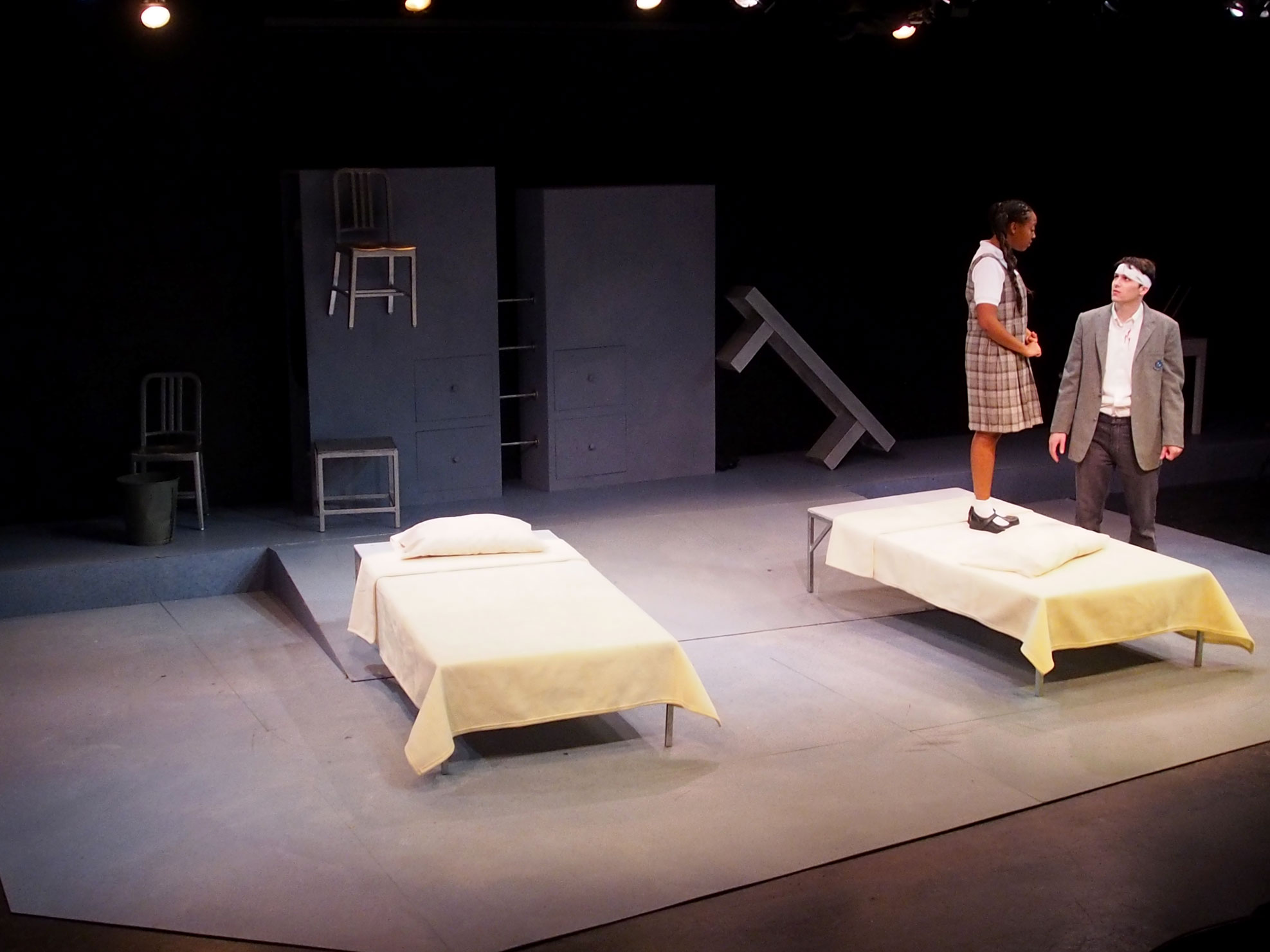
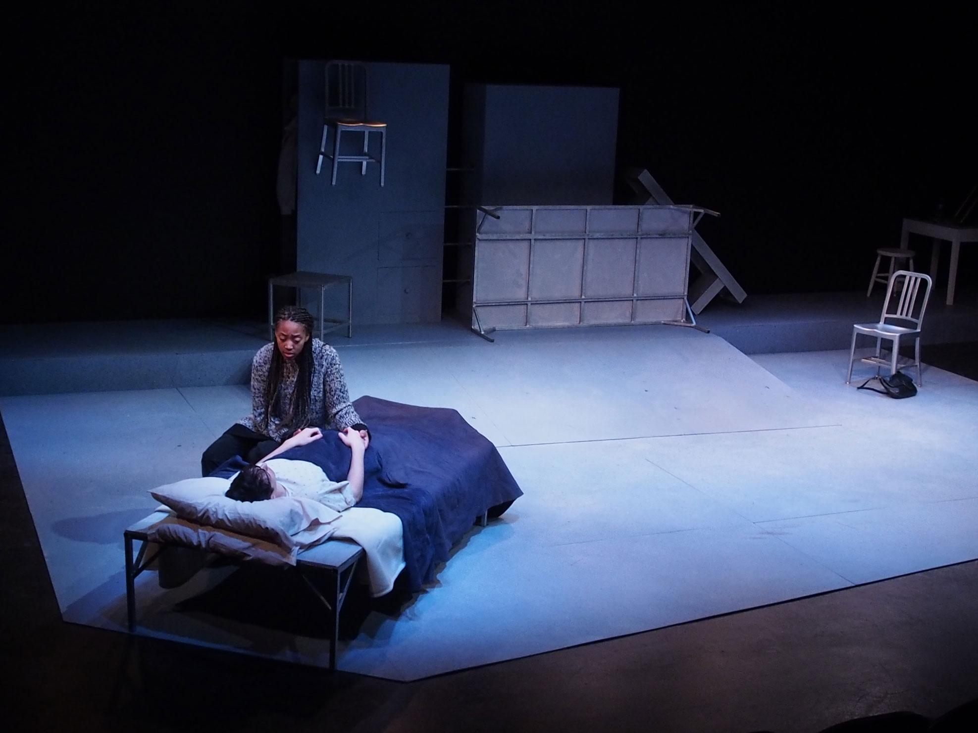
About the Design
Rajiv Joseph places Doug and Kayleen into an imaginary play space in which their relationship exists in fragments, unrestrained by the confines of linear time. Their story is both timeless and universal. Here are two people who connect and love each other, but also cause each other great pain. Their relationship becomes the "playground" of the title.
In the set, I tried to create a neutral space that could become any of the locations required by the script by having actors move simple objects into different locations. The actors never leave our sight. They progress in time by adding costume pieces and adjusting makeup, all done a vista. Closets and drawers are worked into the unit upstage to accommodate, and each actor has a makeup table.
Memory is unpredictable, so everything was a little off kilter.
This is done in a black box space, with a $600 budget.
Production Credits
Directed by Robert Stimmel
Costume Design by Michelle McVicker
Lighting Design by Les Dersham
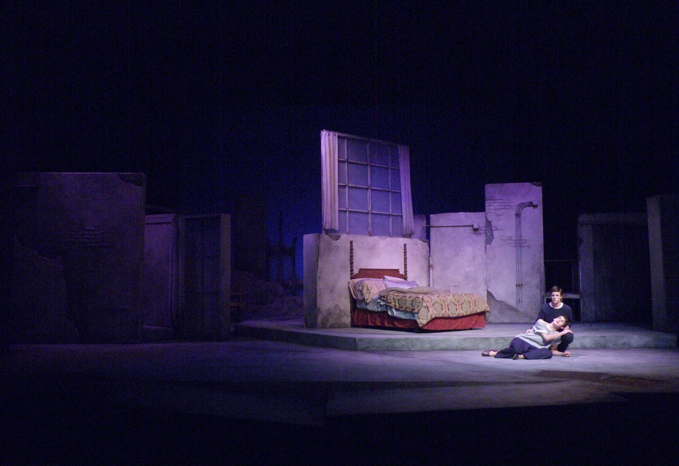
Emotional Creature
Miami University Theatre • October 2014


About the Design
Eve Ensler's book of poems I Am an Emotional Creature: The Secret Lives of Girls Around the World chronicles the many struggles young women face in today's world: body image, human trafficking, violence, love....This stage adaptation uses music and dance to empower the cast and inspire the audience. It is a fantastic piece of theatre, especially as conceived by the director, Rosalyn Benson. The play itself doesn't call for bells and whistles. It needed an environment that could provide levels and provide a surface for movement. In one monologue the actor has just climbed to the top of a mountain, and in another an actor is hiding from a captor. I went with levels legged with pipe and accessed by ladders to accommodate some of this staging. Levels could be climbed onto and hidden under.
The proscenium architecture in this space really separates the stage from the audience. We built an extension off the front of the stage to help overcome that distance. That seemed important for a show with a small cast that directly addresses the audience.
One of the major influences to this design was the art work of Gwenn Seemel. I had never heard of her before, but was fascinated by her background, her artwork, and her subject matter. She is primarily a portrait painter, and the majority of her subjects are women. She created a children's book addressing gender issues. In it she points out how some animals take on different gender roles than humans, and how that is considered normal in the animal kingdom. I loved her message, its connection to the play, and the vibrancy of her artwork. She paints in bold colors and with geometric pattern and line.


I sampled her paintings to create the palette for the show, and mirrored her use of shape.
We did want to use projected images at various points to add more visual texture to the storytelling. I wanted the projection surface to be something more than a rectangular screen that flew in and out. I wanted it to flow out of the architecture of the environment. In this my visual inspiration was architect Zaha Hadid, especially her Mobile Art Pavilion. I was drawn to the movement of the biomorphic shapes:

As the design progressed, the screen structure was pretty large. We were ready to build it, but worried about finishing it in time. I wanted to make sure there was adequate time before tech to create a projection mask to keep the image tight inside of the shapes. I simplified the structure into the series of shapes seen in the production photos.
The images themselves were chosen to either suggest location or to accent themes in the monologues:


A student, Hunter Doebereiner, created a series of video projections as well. Two dance sequences were done with the actors lit by full stage front projections. Hunter also interviewed women on campus, asking questions about topics covered in the play. The resulting videos were shown during preshow.
Here are the sketches and other materials created during the process:


And here is a PDF of the drafting plates (VectorWorks 2014) >>
Production Credits
Directed by Rosalyn Benson
Video Design by Hunter Doeberiener
Costume Design by Meggan Peters
Lighting Design by Jessy Henning
Technical Direction by Curtis Mortimore
Angels In America: Part 1
Miami University Theatre • Fall 2012


Layers of texture, lower Manhattan
About the Design
Prior, Louis, Joe, Harper and Roy come from very different places and have very different lives. They also have much in common. Their world is diseased and falling apart.
This is literal and figurative. The political and religious landscape that surrounds the characters is as toxic as the virus that infects Prior and Roy.
I took a walk through lower Manhattan on a research trip, and it occurred to me how the city is always being torn apart. Beautiful buildings fall victim to urban blight, decay, or a capitalist desire to build larger and more oppressive buildings. In the last decade the City's infrastructure was challenged by a hurricane, and terrorists reduced great steel towers to rubble in a matter of hours.
Another great wall, a few blocks from the previous image
I really took to the textures I saw in these research images. The ghosts of old destroyed buildings hung on the sides of the neighboring structures. Concrete, masonry, brick. Striking grey palette.
It seemed natural for these characters to live in an environment that was uneven and falling apart. The infrastructure on which their lives are built no longer support them. One day they will find a way to rebuild out of the ruins. That is the hope the Angel brings.
The characters and situations are mostly real, but Kushner theatricalizes key parts of their lives, and introduces elements of fantasy. The set also strays from realism, from the uniformity of color and texture that ties all the locations together, to the visibility of the scene changes and conventions of the theatre. The two structures on either side of the stage rotate a vista to create looks for the many different locations, and different window units fly in, adding another direction of movement.
Hard surfaces contrast with billowy drapes. We came to think of light fabric as representing the "air" that carries the Angel to us.
Budget was about $3,500

Rocks in the Rambles

The stairs on the NYC Federal Courthouse.
Process Materials
Early sketches were done using Procreate on my iPad. I moved to 1/8" scale models. I did one for each scene, just to nail down all of the possible variations of the revolve units. Finally completed a 1/4" finsihed model, which I also painted the show off of.

Production Credits
Directed by Rosalyn Benson
Costume Design by Letty Delgado
Lighting Design by Russ Blain
Technical Direction by Steve Pauna
"The twentieth century. Oh, dear. The world has gotten so terribly, terribly old."
As You Like It
Miami University Theatre • Fall 2011


A love story! Characters fall in love at first sight, but are blocked by their own awkwardness (and a little bit of villainy). We started talking about it like it was a Jane Austen novel, and this led us to give the play an Empire setting. The Empire look came from Napoleon's deliberate rejection of the ornate decorative style of the Baroque and Rococo. He wanted to associate himself with the Roman emperors. The line is clean, vertical, graceful and elegant.
The design question I faced was how to create a forest environment that would suggest forest and still somehow resonate the essence of the period, while all the time providing a backdrop in which the main signifiers of period, the costumes, would feel at home. I also had to figure out how to make the few scenes outside of the forest work without huge changes in scenery.
For me the feel of the period resonates in the look of the women’s costume silhouette – the height is emphasized with a high waistline, and the fabric tends to be gathered, creating vertical lines. More than that, the fabrics can be sheer, allowing us to see layers through the garments and adding a feeling of airiness.
Inspired by the fashion, I stylized the look of the forest, keeping the lines very clean and the shapes relatively geometric and playful. The vertical is emphasized, and the strips that make up the trunks of the trees mirror the pleating of the long dresses. The structures that make the trunks and the tree tops are open, allowing us to see through layers of forest to the bright sky, and to let light pass through and highlight the contours. The tree tops suggest foliage by picking up a detail of French ironwork of the period.
The simplicity of shape helps make the leap back to the court when necessary. Removing the tree tops from the picture leaves the trunks, which in their rectangular shape can also suggest tall columns, as you might find at the palace.
The costume palette includes whites, creams and pastels. Knowing this, I’ve kept a palette of earth tones (olives, warm greys, browns) in mostly medium to dark values to allow the costumes (and the actors wearing them) to visually advance in the space.


The Little Dog Laughed
by Douglas Carter Beane
Studio 88 Theatre, Miami University • October 2014
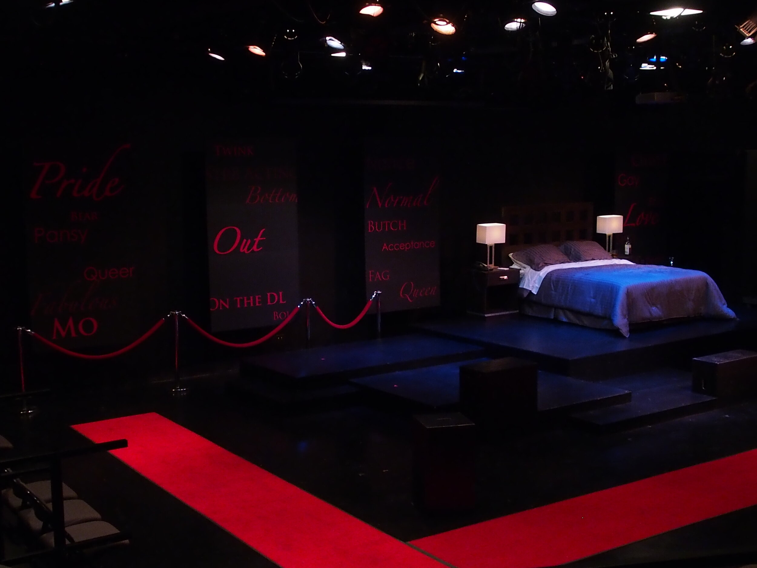
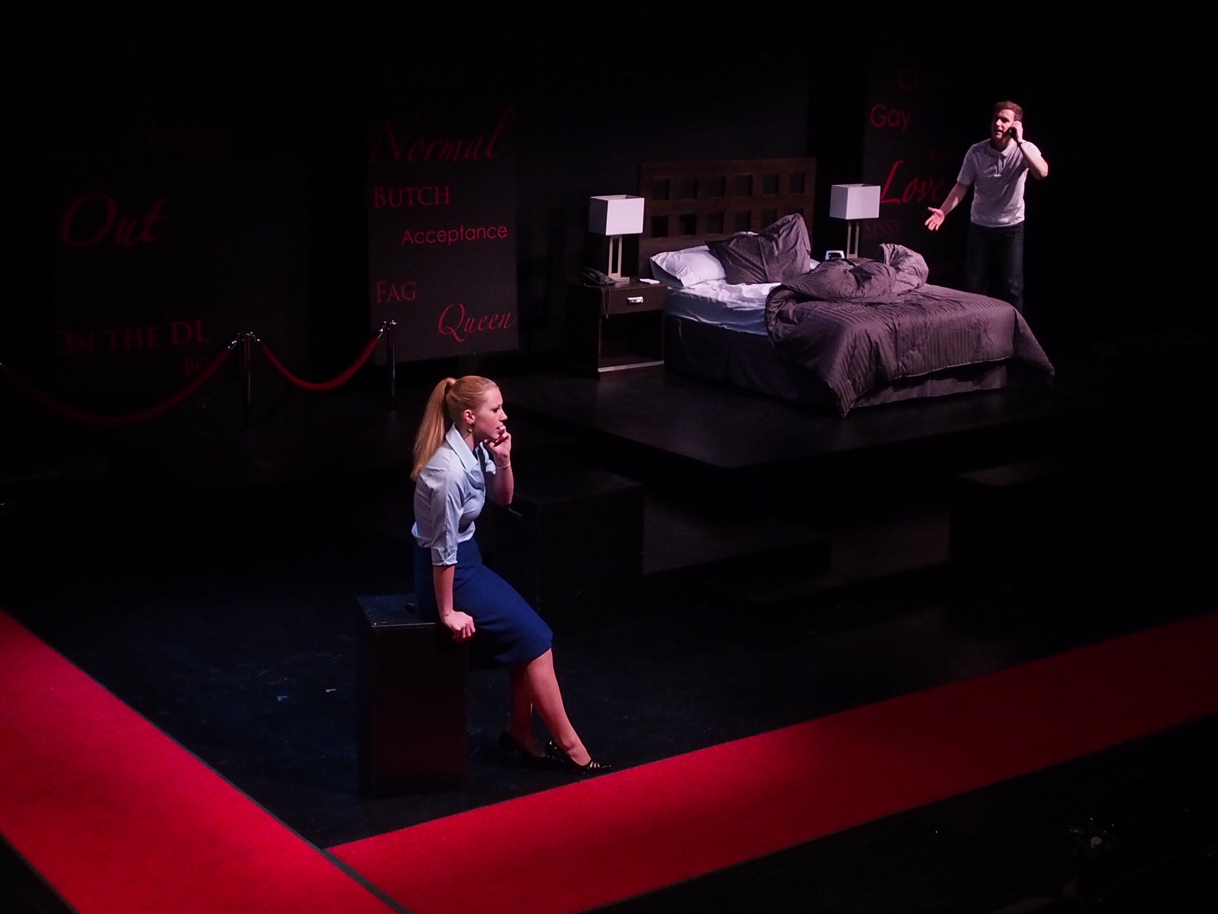
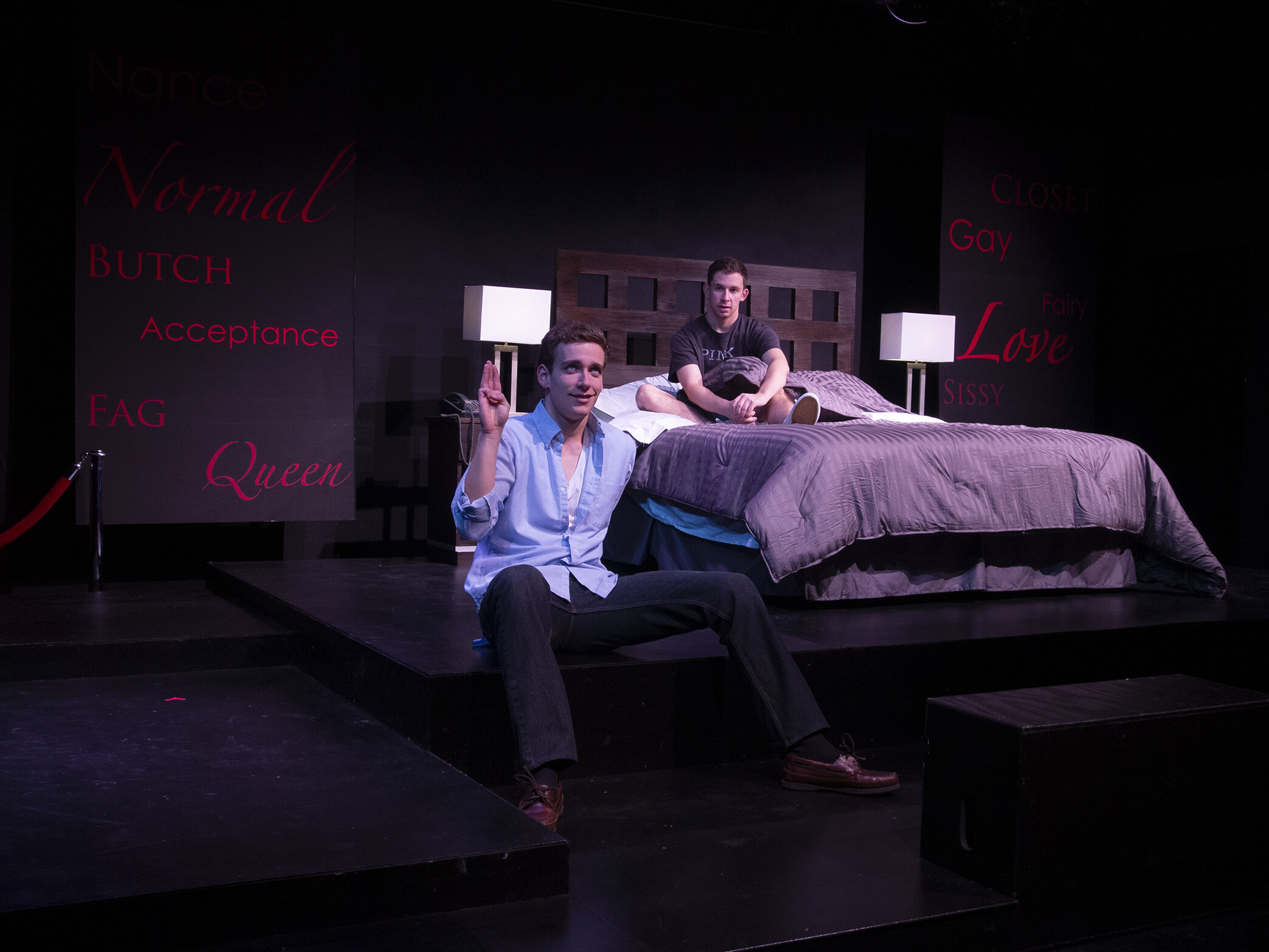
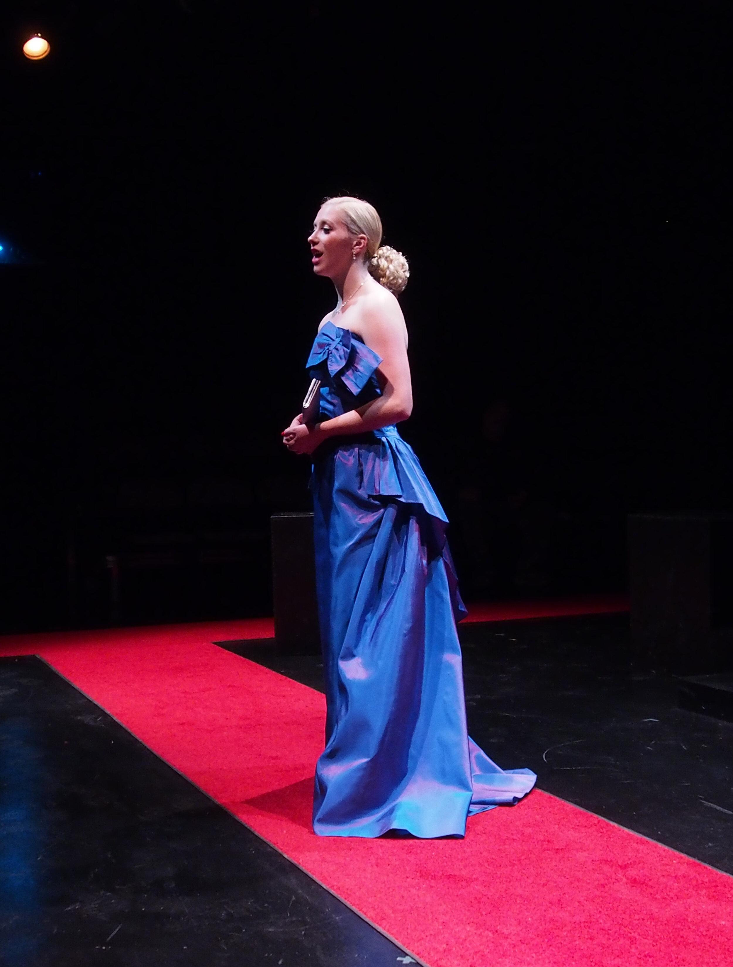
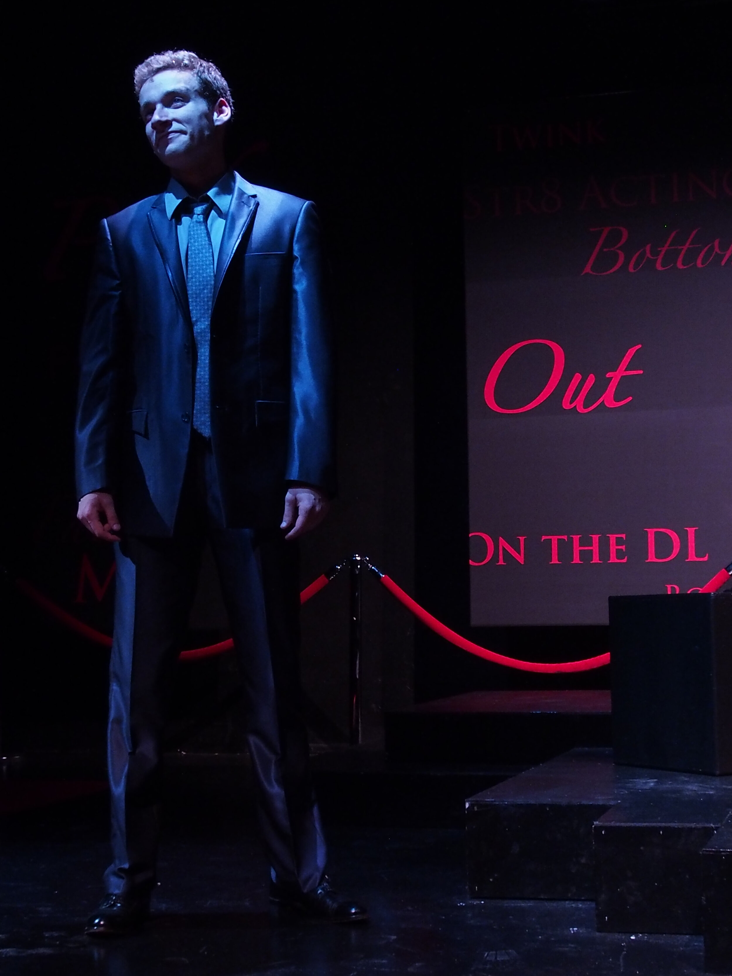
I have a fondness for plays that provide different perspectives on LGBTQIA+ issues. We’ve come quite a long way since Little Dog was written, so it feels a little dated. The character Mitchell buys into the fear that he can’t be a box office star and openly gay, and can’t accept that being gay is just part of who he is. He worries about how others will view him. He listens to his high-pressure agent Diane, rather than to Alex, the hustler with whom he falls in love.
The story is about Mitchell and Alex, as told by Diane. Her storytelling is sharp and direct. The world of the play reflects that. The hotel room is the key location of the story. The dramatic action begins and ends there. It is the source of Mitchell’s underlying conflict: the private versus the public sphere. The hotel is Mitchell’s private space, and has the most realistic elements.
The surround is the constant reminder of Mitchell’s public celebrity persona. It is bounded by red carpet and backed with panels that echo the step and repeats of the press line. The words on them include gay “labels” or identifiers that might be going through Mitchell’s head as he struggles with who he is. Here are some of the inspiration images.
This was done in a black box space. I did reconfigure some of the usual entry paths to allow Diane’s first entrance to come through the audience, and for the audience to feel they were also on the red carpet.

Show Credits (visual components)
Direction by Carly Mungovan
Costume Design by Bobby Vlasic
Lighting Design by Russ Blain
Technical Direction by Curtis Mortimore
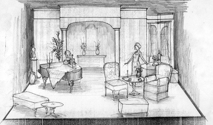
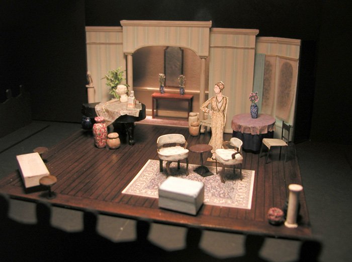
Fallen Angels
by Noel Coward
Ovation Theatre Company, Cincinnati, Ohio
Fifth Third Bank Theatre, Aronoff Center for the Performing Arts

About the Design
Fallen Angels dates from 1925. Coward seems to be having some fun with the “new” Freudian psychology of the time. Jane and Julia repress their sexual desires, and only when they get drunk and release their demons do they shake the guilt of their indiscretions. More so, Coward loads the script with Freudian images. Jane, for example, had her affair visiting the Blue Grotto in Capri and Julia had hers visiting the tower of Pisa.
Nearly every character plays a song on the piano, a recurring symbol of the women’s chequered past. Also needed: a dining table, and requisite lounging areas. The director was interested in pursuing the realistic nature of the piece. He was specifically interested in a set that suggested a real place and suggested the upper middle class status of the characters. He also asked it to “look like a million bucks, but only cost a hundred.”
The Fifth Third Bank theatre, is a black box space. We chose to play in thrust to allow a more realistic sense of movement and to maximize the number of patrons. Playing space allowed in this configuration was approximately 20’-0” x 20’-0”
The show was designed to be built by a corps of volunteers under the supervision of a Master Carpenter. There would be a total of about 40 hours scheduled to build the set in an offsite warehouse facility with limited tools. There was a stock of 6 standard 4 x 8 Hollywood flats and 4 standard 1’-6” x 8’-0” Hollywood flats
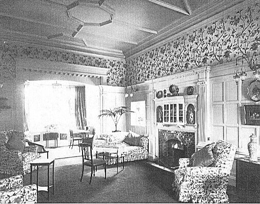
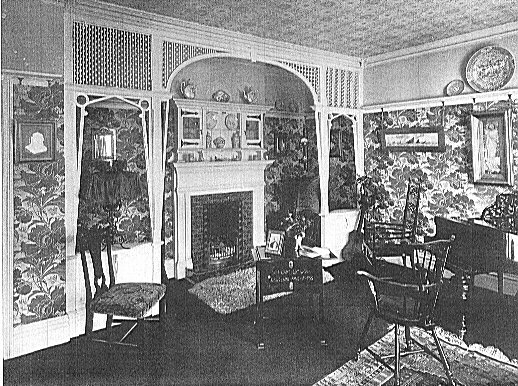
Practically I wanted the house to be stylish, but not in the “latest fashion” which would likely have have been Art Deco. To reinforce the idea of repression, I wanted the characters trapped in an earlier style. The characters needed to be Deco figurines in an old-fashioned case. I researched Edwardian décor, and fused it with neoclassical and even Regency flair. These choices give Jane added ammunition when in anger she insults Julia about the poor taste used in the flat (“Never mind. You’ll get used to it in time”).
I also wanted to play with the Freudian imagery Coward was introducing. Architecturally, the archway is held up by columns which flank a large opening (a central archway). The dressing consists mostly of vases (and other vessels) and candlesticks.
Process Materials
Here is a gallery of some of the design artifacts: sketches, the model, and research. In the end, I do believe the overall cost of the set was under $200.
Production Credits
Directed by Joe Stollenwerk
Costume Design by Chad Phillips
Lighting Design by Diana Bentley and Eric Bardes
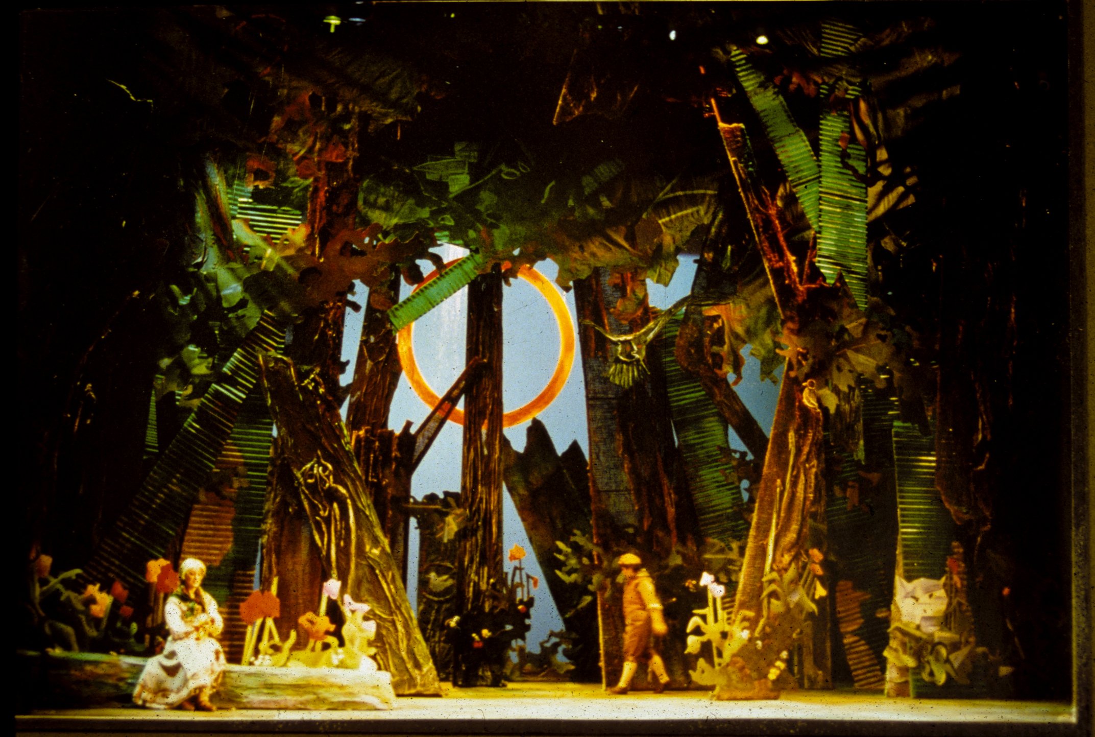
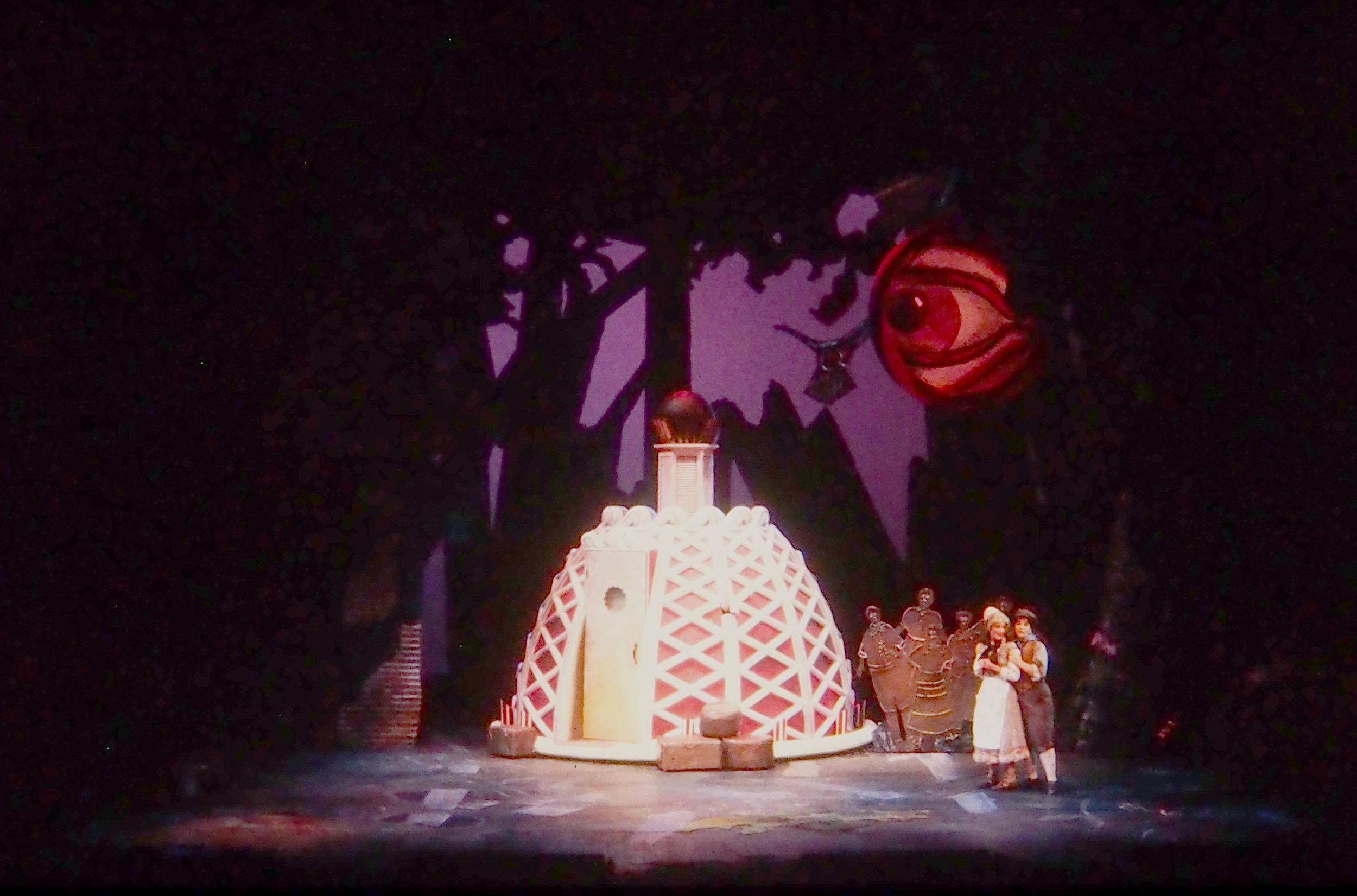
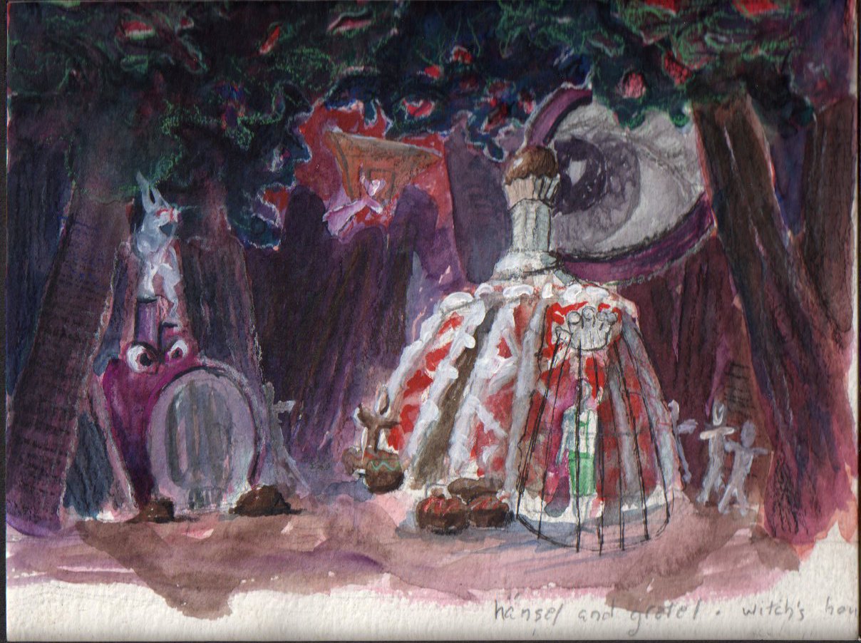
ABOUT THE DESIGN
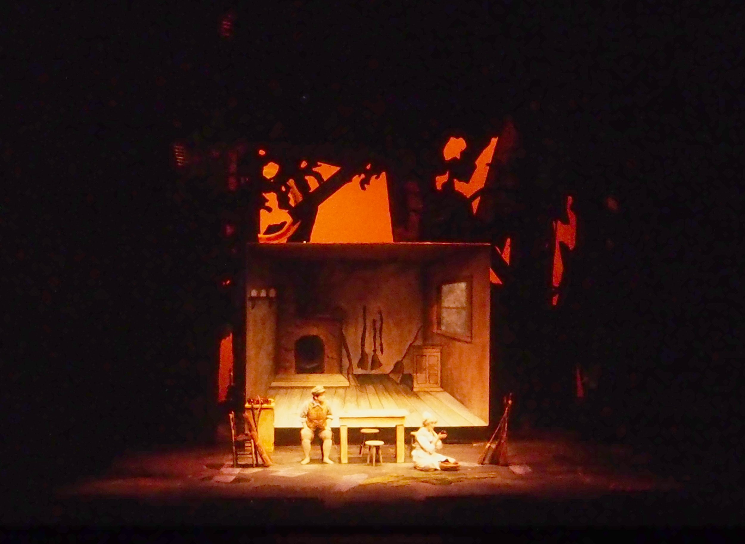
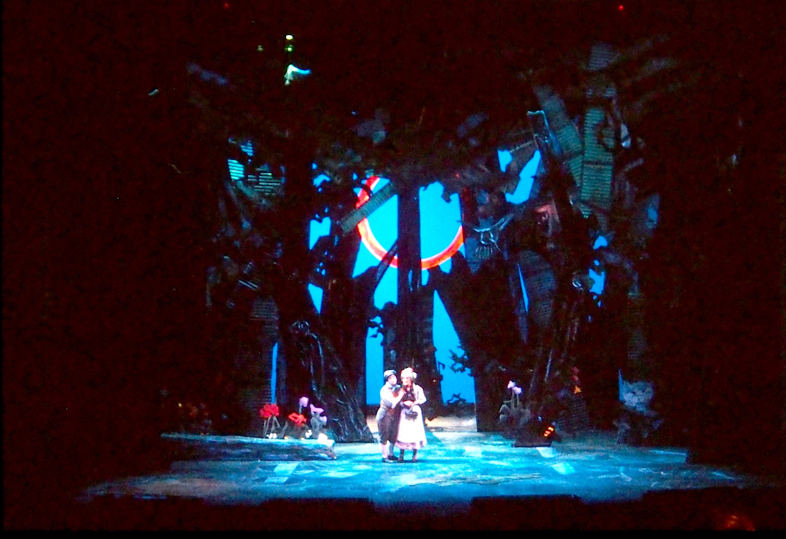
This is an early career design, and maybe the most influential. The director, Bruce Donnell, came to the first meeting with the idea that the play would be well served with visual imagery of Arthur Rackham characters in a Max Ernst world. I was uncomfortable with what seemed an odd mashup, but Bruce’s confidence ultimately helped me see the power and beauty that stylistic contrasts can bring.
I also felt free to play. The design evolved through collage (like much of Ernst’s work), and the idea of collage continued in the choice of materials that made up the trees: corrugated fiberglass, erosion cloth, sculpted paper, and wood. The shop was able to repurpose old drops to make the borders. The tempting Witch’s house was modeled after one of the most popular pastries in the venue’s (the Krannert Center for the Performing Arts) cafe.
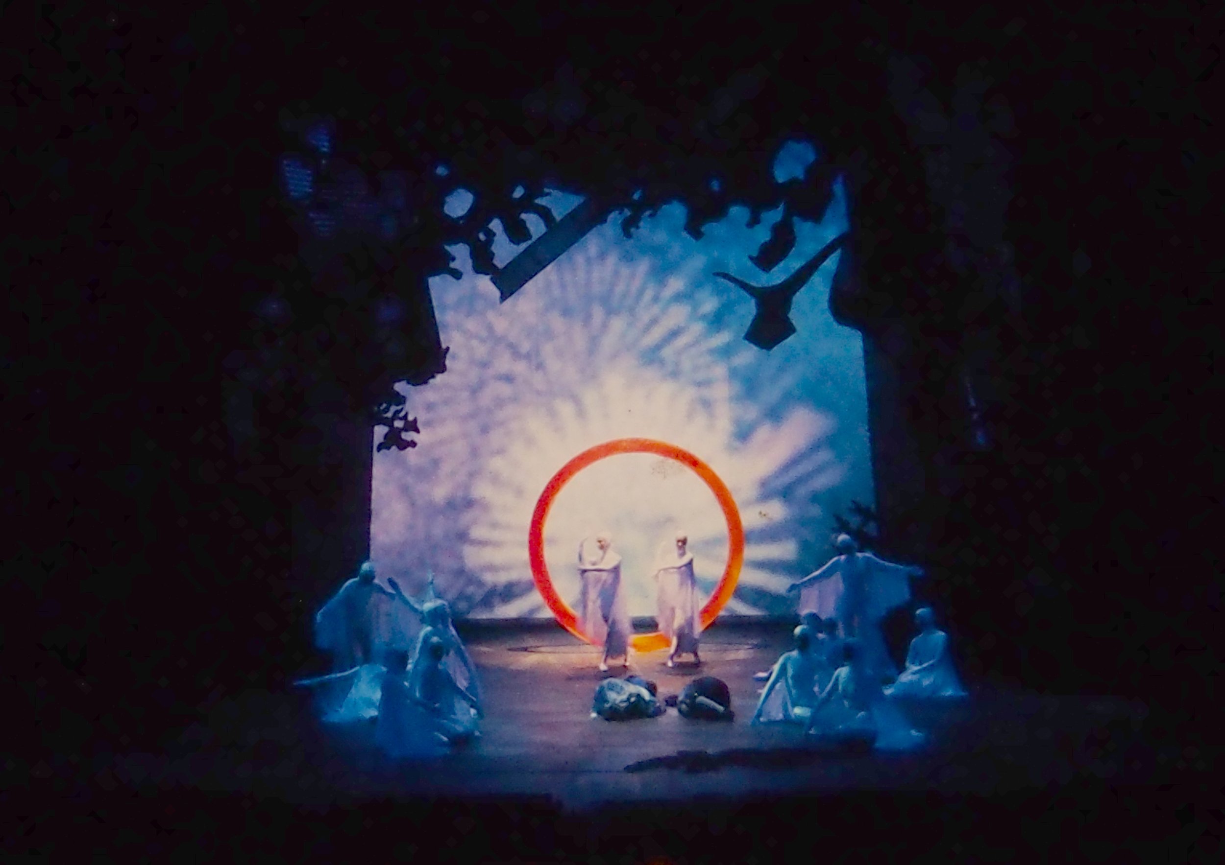
Ernst’s forest paintings often featured a ring, and that became a unifying symbol of good in the design. Each act had a different one. The second act ring was the largest and most active. When the children are lost and lay down to sleep, the forest cleared, the ring descended, and the angels danced through the ring to protect them.
PROCESS IMAGES
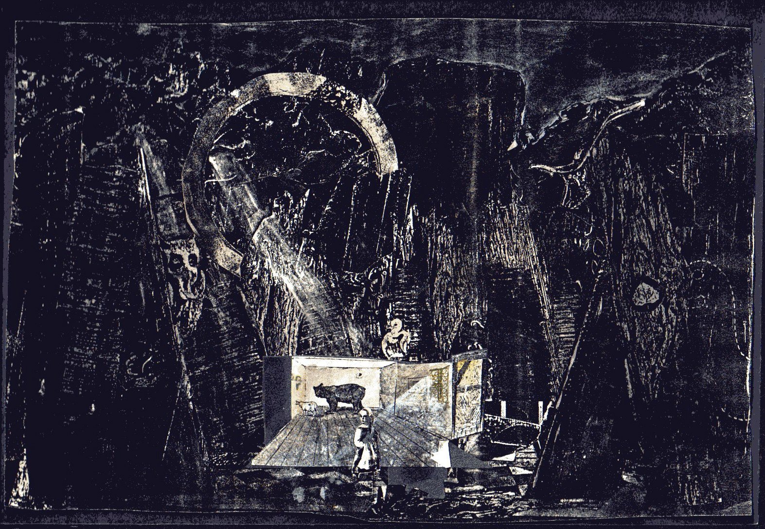
The design was featured in the 1994 USITT Design Expo and was chosen to be included in the expo edition of Theatre Design and Technology.